The first technique uses Nevrdull (or a similar product called Duraglit) which is chemical impregnated wadding intended for polishing metal. Neverdull is available in automotive stores in the US, and also in larger branches of Walmart. Duraglit is available in supermarkets in the UK intended for polishing doorknobs and knockers and other household metal objects - it may be in the process of changing it's name to Brasso, but if you buy brasso make sure it's not the liquid.
Basically, the wadding acts as an eraser on colour magazine pages. So, you can remove all the colour and image, or fade an image, or play with an image by removing parts...
Here are a couple of examples of what I did:
 I removed a line of washing strung between the trees,
then removed even more colour, using a stencil, to create a 'ghost'
 I gently rubbed over the whole picture,
then rubbed another couple of times around the edges, to create a 'faded' look
 I folded the whole picture up, then re-folded the other way,
using the same fold lines, to deepen them.
I rubbed all over to take away quite a lot of colour,
and created a 'faux tile' effect.
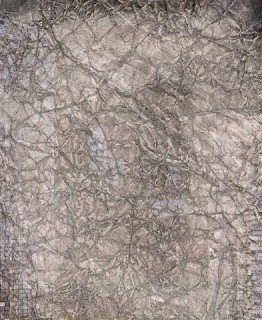
 If you scrunch the paper up into a tight ball,
then flatten out and scrunch up again,
you create lots of neat fold lines.
Remove some colour and you create a 'leathery' look - in
the sample above I left enough colour for you to see what the image was,
and it gives a 'French Impressionist' feel to the page.
I completely removed the logo
and the 'catchphrase' at the bottom of the advert,
but left the text at the top - is it like some indistinct poem,
adding something to the overall piece.
You may not be able to see that unless you double click on the picture.


No comments:
Post a Comment