Showing posts with label Viva perle pen. Show all posts

Sunday, 19 August 2012

ATCs


I belong to a small international ATC swapping group.  

Each player takes it in turn to be hostess, and to set the theme for that month.  Some of the themes are challenging, and it's always interesting to see how everybody interprets the theme.

These are a few of the ATCs I've made for that group this year.

The first ATC is a textile ATC, made by sewing all sorts of snippets of fabric and fibre to a pelmet vilene base, zigzagging around the edge, and hand embroidering and beading.


The ATC below was my first attempt at the theme of 'A Clear Layer'. I created a fleur-de-lys stamp by drawing on fun foam, and stamped it with a kaleidoscope inkpad. I had masked the fleur-de-lys itself, and then I sponged that shape in purple. I stamped over the fleur-de-lys with a texture stamp and gold ink.  So far so good, and lots of subtle texture and colour, all pastel and way out of my normal colour palette.

I decided the clear layer should be clear sticky backed plastic.  I snipped some angelina fibres, and scattered them over the ATC before sticking down the plastic.  And then I realised the plastic stopped all the subtle texturing I'd done being visible. Harumph. It just looked really ordinary.

I decided to try and improve things. I drew round the fleur-de-lys shape with a bronze Viva perle pen, and used a white one for the rest of the design.  

I left it a few hours.  

I drew dots around the edge.  

I left it a few hours.  

I drew dots in the middle. 

It was better, but I still wasn't happy.  I ditched it.


Clear layer 2nd attempt.  I took some cardstock, and made a background by smearing some Distress ink onto a craft sheet, spritzing with water, and 'smooching' the card through the ink.  This makes a lovely unpredictable background which is very useful for ATCs. Once I had my background, I created a digital collage in Photoshop, in similar colours to my background. I had some clear digital letters (Tangie Designs)so added the word at the bottom. Once printed onto my background, I stamped the flower, and smeared a trace of Stickles around. I then printed the text and butterfly design (Tangie Designs) onto inkjet acetate, and added it to the ATC using brads. I am much happier with this.


Zettiology ATC.  I'm not a huge fan of zetti, although I see things which other people have done and which I quite like. I did once take part in a huge journal pages swap, which was kind of zetti and which I enjoyed, but mostly it doesn't come naturally to me.

I was very fortunate, because my friend Chrissy took the time and trouble to send me a birthday card, and the card she sent was a zetti design.  I liked her design, so created a small adapted version in this ATC. The black background has been embossed in an embossing folder, and the 'body parts' are all shrink plastic.  The rest of the design elements are hand drawn with a white pen.


Sunday, 15 January 2012

Odd shaped art

Annie ran a swap last year, where we all made 6 little pieces of art to fit plastic pockets of an odd size - hence 'odd shaped art'. Of course, once in the plastic pocket page, we realised we needed six more to go on the other side of the page...

So, here are my second set of odd shaped art. My new scanner is very clever, and as well as scanning it does this autocrop thing when you scan several things at once. Unfortunately the autocrop feature sometimes crops the bottom off things! So one or two of these have lost their bottoms....

The first is on canvas, two image transfers (one behind the heart), and a collaged photo of a sculpture, plus a friendly plastic broken heart and some Tim Holtz music tape. The word and the (cropped) dots were done with a Viva Perle pen.


This background was watercolour paper covered with tissue and painted with a dozen or so thin layers of acrylic paint - it starts to look and feel like leather. Between the last couple of coats, I scribbled with an iridescent oil pastel crayon, you can see the metallic glimmer through the paint. Then I covered almost all of it up with a Klimt image, some Tim Holtz tape, and some german scrap!


This background was made by painting cardstock generously with gesso, and stamping into it whilst wet. A quick sprinkle with salt, and a spritz with watered down Quink permanent black ink, and leave to dry. The salt dissolves a little, leaving little pitted textured areas, and the ink separates out to give patchy mottled colours. I stamped a zodiac stamp onto a paint sample, added some Tim Holtz tape and the word and dots with the Viva Perle pen.


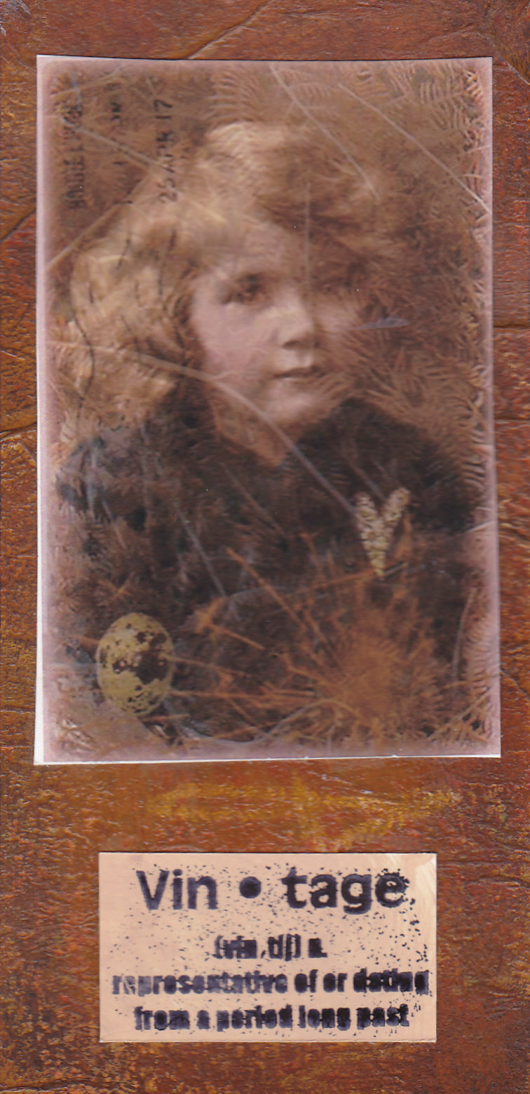
More of the acrylic paint background, this time covered with a digital collage (all my own work), and a stamped definition.


This one is really shimmery in real life - shame the scan never captures that. Moonshadow sprays on watercolour paper, with interest added by sponging acrylic paint through a sheet of ironed angelina. I added a stamped image (Stampers Anonymous), some german scrap, and some letters.


Finally, the background to this is made by crumpling waxed paper, ironing it onto glossy cardstock, then sponging dye ink on. The wax resists the ink, and creates this lovely pattern. I've had this image for ages but never found anywhere to use it. The background colours reminded me of India, so it seemed appropriate to use it at last. I punched three flower shapes out, and backed the holes with some pearlescent pinky red card, and added some sari ribbon. Clever autocrop chopped the bottom off!


Guestbook

Copyright

Please note that I assert myself as the creator of all art on this site (unless I credit another artist) and retain copyright of all artwork posted on this site