Sunday, 24 February 2013

Fragments ATCs

Made some ATCs today, on the theme of 'printed papers' - they had to have a background made of printed paper.  I stuck and old book page to my card backs, and sprayed with gunmetal and pearl colour mist sprays from Outside the Margins.  I added Golden black mica flakes around the edges, and used a diamonds stencil to apply Golden micaceous iron oxide down one side. I added some dots to add texture and dimension, using a pearl pen.


So far, so good.  I then made, and tried out, a whole series of embellishments on the ATCs, and none of them worked. I thought an image might work, but I have no long tall stamps, and none of the images in my collection are that shape either.

 So I stamped a swirly pattern down the right hand side to see if that would help. It looked better.  I tried a whole bunch of other things before settling on pieces of shrink plastic - fragments of images on one, fragments of text on another, and fragments of numbers on the last one. Works for me....


Monday, 11 February 2013

Doors ATCs

The theme for my monthly ATC swap was "doors and what's behind them."

Here is the front of the ATC I created:


The front of the ATC, the door itself, is made from scraps and odds and ends of sticks of friendly plastic.  I just cut all my scraps into smallish pieces and laid them all out onto a craft sheet, as close together as I could get them. I took another craft sheet and laid it on top, and ironed them until they melted together into a an A4 sheet approximately half the thickness of a friendly plastic stick .  I guess you could use a skillet for this if you have one, but your sheet would be thicker.  There were small gaps, so I added some more pieces of friendy plastic and ironed again. 

I then used a Spellbinders ATC die and my Wizard to cut ATCs form the sheet of friendly plastic. I rubbed the ATCs all over with olive bronze Treasure Gold, to hide most of the mixture of colours of friendly plastic. Each ATC was then laid onto the craft sheet, heated with a heat gun, and stamped into with the diamond patterned stamp (Invoke Arts).  I allowed the friendly plastic to completely cool before removing the stamp, and added more olive bronze Treasure Gold to give good coverage, then used renaissance gold Treasure Gold to highlight some of the raised areas. I punched a hole, then added a bead cap and brad to make the door handle.

Here is the what's behind the door:


The door is hinged with organza - the friendly plastic was carefully heated down one side and the organza was pressed into the warm plastic.  I then cut pieces of very thin wood sheet (maybe this is marquetry veneer?) to size, inked them to age them, and stamped them using the same stamp as the front of the door, before sticking them to the friendly plastic with red liner tape. The other part of the organza hinge was trapped between two layers of card stuck together with red liner tape.

The backgrounds of the inside were created using the layered paint technique as detailed in a previous blog post.


I cut this background into ATC sized pieces, stamped the words onto some paper from a very old book and glued them onto the background with gel medium.

Why 'Pieces of History'? Well, all the elements of the ATC are pieces of my history.  The friendly plastic was all left over from other projects.  The layered paint technique was learnt at Art & Soul during a fantastic trip to the USA back in 2007, which is part of my history.  It was painted onto a base of cardboard bpxes which used to contain one of my favourite smoothie ice lollies, and the book pages used for the words are from an old book which I have had for a long time, again part of my history.

Thursday, 7 February 2013

Distress Ink tags

I made some tags for a swap. I was really pleased with them, so I thought I'd put a short tutorial here on how they were done.


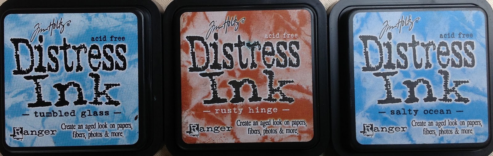
I used these 3 colours of Distress Ink, plus Walnut Stain.


Firstly, I used the ink application tool with sponge to apply a layer of the lighter blue, and some of the rusty hinge. I added the darker blue round the edges.  I ran two tags through my Wizard in a Cuttlebug folder, then used a stencil on the other two - one has moulding paste applied, the other was inked through the stencil  - I used all 3 colours of ink for this.


I added more ink to the raised areas of the two embossed tags,mainly rusty hinge but also some of the darker blue,  and stamped the stencilled tag to add more 'texture'.


I inked up the tag with moulding paste, again using all three colours of ink.


I didn't neglect the backs of the tags, the embossed tags were just inked with the rusty hinge, the other tags were inked with all 3 colours, and stamped with a distressed paisley stamp in the darker blue.


Finally, I added depth and texture by applying Walnut Stain ink around the edges, and sprinkling with Detail Clear embossing powder, and heating with my heat gun.  I wanted the effect to be subtle, so I rubbed some of the embossing powder off with my finger before heating - this made it thinner in some parts than others, and also blurred the line where the embossing powder finishes.

I created some backgrounds using the tag card and inks, and stamped them with the lighter blue ink and the same textured background stamp as the tags, before stamping Leonardo images onto them, and adding more of all 3 inks with the applicator tool.  I stamped some words onto offcuts. I layered the images onto very thin layer of wood, which I had coloured using the same ink, then added to the tags with the words.  I only have 3 Leonardo stamps with the right size images for the tags, so the last tag has a panel with some stick on letters spelling Da Vinci.
  

Close up of the front of the assembled tag book.


Sunday, 30 December 2012

Alphabetica Y - layered paint tutorial

About 5 years ago I took a class 
with Ann Baldwin at Art & Soul, in Portland. Ann has been moving from painting to photography, and her photography is interesting but I prefer her paintings. Perhaps when she's been doing photography for as long as she's been painting, I'll like the photography as much as I like the painting!

Ann paints beautiful paintings by layering acrylics - sometimes 45 or more layers. She adds texture by adding papers and other media and textured elements between the layers. I decided on a simple version of what I learnt for Y.

I took some scrap cardboard, and painted in with a thin layer of gesso. 


I gave it a second thin coat.


I got out some gloss gel medium, and a palette knife


Once I'd coated the card with gel medium, I added texture with cookie cutters, a rubber stamp, the wrong end of a pencil and a mini mister cap.


I let it dry.  You can only tell if it's dry by touching it.


I got my paints out - these, and every yellow I have. I love these paints, the colour is still strong, even when thinned with water, or applied in thin layers.


Using my brightest yellow, I painted the hearts. This may look a bit like fried eggs at the moment but it will improve, honest!


I gave it a coat of Nickel Azo Yellow. Transparent colours are best for this technique, but you apply the paint so thinly that you can get away with less a transparent layer every now and then.


I gave it a coat of Transparent Yellow Iron Oxide..


I took my paintbrush and went around the hearts with a thin layer of Yellow Ochre. This was still a very thin layer of paint, but I added some uneven-ness by painting some areas more than once.


I added a touch of red for contrast - I made a mask then stamped each heart with a dotty stamp and red Stazon.


Doesn't look like fried eggs any more, I'm starting to like it now.


Next, I stamped some words over the spots - big improvement - and then painted some of the circles with Iridescent Bronze. This is very bright, but it will mellow when there are some layers of transparent paint on top.


I added a layer of Nickel Azo Yellow. See how those bronze circles have warmed up?


Another layer of Nickel Azo Yellow. I like this - it could get much richer with more layers and the introduction of other colours, but this peice has to be Y for Yellow, so I'd better stop. There are about 10 layers of paint here.


The back, though, well that's another matter.  I'd done everything so far (apart from the red spots)  to another piece of card to be the back of the piece.

I added layers of Nickel Azo Gold, Transparent Burnt Orange, and Transparent Iron Oxide Red.  I painted some of the gold hearts with Turquoise, very thinly. I layered in Iridescent bronze at different points so there would be different colours of gold in the piece. It looks like rich leather.


This is similar, but more deep colours added - about 17 layers of paint here.


You can make it brighter, depending on which colours you use.  Somewhere in the middle of this, there was a Turquoise layer, which turned the yellowy areas green, and the reddish areas slightly greeny browny.

This is a really easy technique which produces really rich surfaces with lots of depth and deep shine.  The trick is just to have patience, and take the time to paint many layers but keep the layers really thin, and to make sure each layer is completely dry before adding the next (use a heat gun if you're as impatient as me!).


Saturday, 29 December 2012

Alphabetica U & V

This month's Alphabetica pages relied heavily on Golden fluid acrylic paints and embossing folders put through the Wizard...

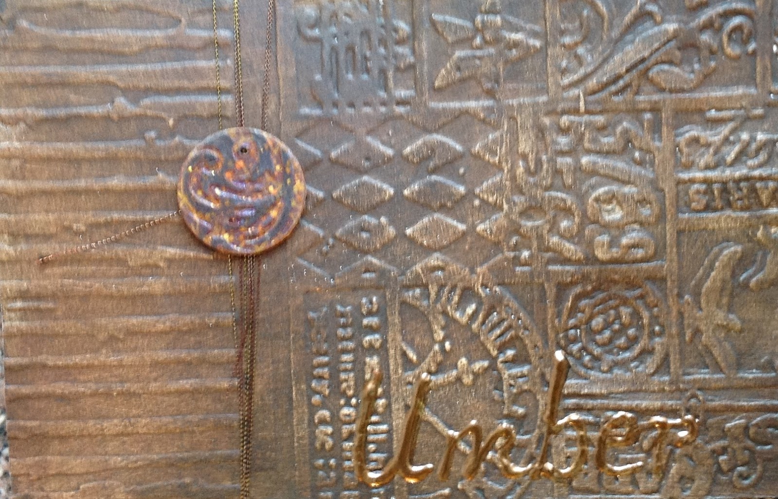
U is for Umber, embossed with 2 different embossing folders (Cuttlebug, Tim Holtz) painted with a couple of coats of Golden fluid acrylic raw umber, and the word 'umber' drawn with a Viva Pearl pen. The little circle is just a couple of layers of card, run through and embossing folder and painted.


The back of the card is done in the same way, but using burnt umber paint, somehow it always surprises me that burnt umber is lighter and richer than raw umber, I always imagine burnt things to be darker and greyer...


V is for violet was a bit more fun, I used a brocade embossing folder and Golden quinacridone violet.  This looks more like fuchsia or cerise to me than Violet, but they are a professional paint company and who am I to argue? The flower is organza, which I cut into circles, then cut towards the centres and held over a candle to make the 'petals', before attaching with a gold brad. The lettering is done with gold Stickles.


The back of V is Viridian. I like Viridian, it is very close to Teal/Turquoise, which is my favourite colour (you may have noticed this!). Same techniques as U & Violet. I was really tempted to add a little Treasure Gold to the high points, but then they wouldn't have been pure colours....


Friday, 28 December 2012

Metal ATCs

For this swap, I needed to make 3 ATCs which featured metal. 

I decided to use metal tape, but to add image and texture by putting peel offs onto the card bases before applying the metal tape.  I also used Dyna tape labels for the words.

This is the first stage:


This is the next stage:


The first ATC is coloured with alcohol inks - butterscotch and lettuce with a touch of pesto.  I applied them all separately, but they pretty much mingled into one colour.  I added some more to mottle them, but it just blended, so I took the hint and left them alone!


The second ATC - 'oak' - was painted with several colours and coats of Pebeo glass paint, sanded with a fine sanding block, then overstamped with a tiny oak leaf in Brilliance Coffeebean ink. I wasn't thrilled with the outcome so put it to one side for a while.


I added some alcohol inks and felt it had improved.


The distressed damsel was also peel offs under metal tape, but this time I added a second layer of metal tape, and trapped a chipboard frame and image between the layers. I then painted the metal tape with Stewart Gill Byzantium paints, then sanded it down, and added a little Treasure Gold here and there, then sanded again to make the high points more prominent.


Tuesday, 25 December 2012

12 days of Christmas presents

Each year on the UK Art Swaps group, we run a '12 Days of Christmas' swap, where each player makes 12 small gifts, wraps and sends them to 'Mother Santa', who swaps them out and sends a set of 12 gifts to each player.

Some of us start opening one present a day from 12th December onwards, some wait until Xmas Day to open them all, and some probably open them all the moment the package arrives!

The hardest part of the swap is deciding what to make.  It needs to be reasonably small, and light, so that the postage doesn't cost too much. The cost of making the gifts is also a factor because when you're making 12 of something the costs can mount up quite quickly.

This year I decided to make some brooches.  I used some recycled wool fabric for the base, and needlefelted wool rovings onto both sides, to make a fairly sturdy felted fabric. 

I cut leaf shapes from this felt base, and machine sewed velvet leaf shapes onto them.  I used variegated Perle thread in my bottom bobbin to sew round the edges of the velvet, and the leaf 'veins'.

I sewed around each brooch a few times using metallic thread, so that each brooch has a subtle hint of glimmer.

To finish the brooches off, I got out my needles and thread and hand sewed french knots and beads to the fronts, and brooch backs to the backs.

I hope the recipients like them!


A closer view.


Friday, 7 December 2012

My rusty heart ATC


This month's ATC theme was 'rust'. 

I decided my neglected heart is getting rusty, and thought I'd interpret that in the ATC.

The background is cardboard painted with Modern Options iron surfacer, left for 12 hours then painted with  Modern Options rust solution.  It didn't get rusty enough, so I gave it another coat of the rust solution a few hours later.

Somewhere on my travels, I bought a small roll of rusty mesh, I added strips of this, held in place with some brown heart brads.


The heart is card, embossed in a cuttlebug folder, then painted with Golden micaceous iron oxide mixed with some  umber, red and orange fluid acrylic paints.  This gave it the colour I wanted, but the texture was a bit too fine and wasn't rusty enough, so I added Distress embossing powder to the high points.

The heart is adhered onto the background with some little sticky foam pads, to give it a little depth.

I really like this one. Glad I get to keep one.

Thursday, 29 November 2012

Ancient stash tags


I made 3 tags for a swap.  

The swap rules were that 'ancient stash' (anything you've had and not used for more than a year) had to be used to make the tags.

I dug out my Modern Options patinating solutions. I wasn't even sure if they would still work, I haven't used them for a couple of years.  I painted one tag with the 'blackened bronze' base, another with the 'blonde bronze' base, and the third with the 'iron' base. I also painted some card offcuts with the copper base.

I painted the bronze and copper bases with the green patina liquid while they were still tacky, and left the iron base to dry overnight before painting it with the rust liquid.

The results were a little patchy - but they often are if you don't get the timings right - so I gave the rusty one another coat, and redid the blackened bronze and green patina one.

Once dry, I ran each tag through the Wizard in two different embossing folders, and highlighted the raised areas with Brilliance ink


I stamped and embossed architectural images down the centre of each patinated offcut of card, and attached these to the tags with brads. I wrapped some metallic thread around the non-embossed 'stripe' I'd left on each tag, and added some air-dry clay embellishments I had made a couple of years ago. I added a touch of Treasure Gold to the embellishments, in colours which toned with the tags. Finally, I threaded and knotted a selection of fibres to the tags to finish them off.


I'd forgotten how lovely the patina solutions make cardboard, I should probably go and paint lots of pieces of card for my stash, to use these liquids up before they lose their potency.

Hope the recipient likes the tags as much as I do, these were a little hard to let go!

Tuesday, 27 November 2012

Fabric ATCs

I made these for the small international ATC swaps group I belong to.  

September's theme was 'woven', and this is my interpretation.

I used Ranger Adirondack color wash sprays to dye pelmet vilene, before cutting it up and weaving it together. I hand embroidered a 'darned/woven' area, and added small pieces of pelmet vilene with the words stamped on them.  To finish, I cut two circles of card and used a brad to attach them.


October's theme was 'fabric & fibres' and this is my interpretation.

I needlefelted scrim to a wool fabric base, then needlefelted some wool rovings to the back to bring subtle colour through to the front. I couched down some knitting yarn with Perle thread, and added a line of stitches in fine gold metallic thread.  I used toning and contrasting threads for the french knots and seed stitches, before  finishing the ATCs by backing them onto pelmet vilene with machine zigzag.


Guestbook

Copyright

Please note that I assert myself as the creator of all art on this site (unless I credit another artist) and retain copyright of all artwork posted on this site