Showing posts with label cuttlebug. Show all posts

Thursday, 7 February 2013

Distress Ink tags

I made some tags for a swap. I was really pleased with them, so I thought I'd put a short tutorial here on how they were done.


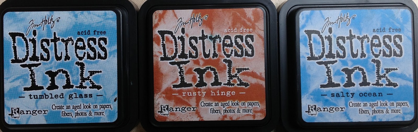
I used these 3 colours of Distress Ink, plus Walnut Stain.


Firstly, I used the ink application tool with sponge to apply a layer of the lighter blue, and some of the rusty hinge. I added the darker blue round the edges.  I ran two tags through my Wizard in a Cuttlebug folder, then used a stencil on the other two - one has moulding paste applied, the other was inked through the stencil  - I used all 3 colours of ink for this.


I added more ink to the raised areas of the two embossed tags,mainly rusty hinge but also some of the darker blue,  and stamped the stencilled tag to add more 'texture'.


I inked up the tag with moulding paste, again using all three colours of ink.


I didn't neglect the backs of the tags, the embossed tags were just inked with the rusty hinge, the other tags were inked with all 3 colours, and stamped with a distressed paisley stamp in the darker blue.


Finally, I added depth and texture by applying Walnut Stain ink around the edges, and sprinkling with Detail Clear embossing powder, and heating with my heat gun.  I wanted the effect to be subtle, so I rubbed some of the embossing powder off with my finger before heating - this made it thinner in some parts than others, and also blurred the line where the embossing powder finishes.

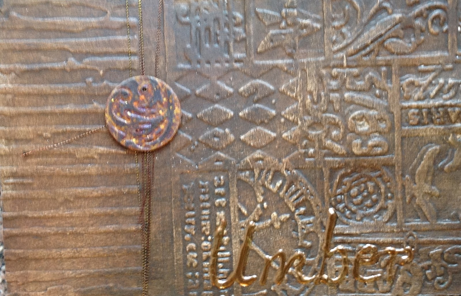
I created some backgrounds using the tag card and inks, and stamped them with the lighter blue ink and the same textured background stamp as the tags, before stamping Leonardo images onto them, and adding more of all 3 inks with the applicator tool.  I stamped some words onto offcuts. I layered the images onto very thin layer of wood, which I had coloured using the same ink, then added to the tags with the words.  I only have 3 Leonardo stamps with the right size images for the tags, so the last tag has a panel with some stick on letters spelling Da Vinci.
  

Close up of the front of the assembled tag book.


Saturday, 29 December 2012

Alphabetica U & V

This month's Alphabetica pages relied heavily on Golden fluid acrylic paints and embossing folders put through the Wizard...

U is for Umber, embossed with 2 different embossing folders (Cuttlebug, Tim Holtz) painted with a couple of coats of Golden fluid acrylic raw umber, and the word 'umber' drawn with a Viva Pearl pen. The little circle is just a couple of layers of card, run through and embossing folder and painted.


The back of the card is done in the same way, but using burnt umber paint, somehow it always surprises me that burnt umber is lighter and richer than raw umber, I always imagine burnt things to be darker and greyer...


V is for violet was a bit more fun, I used a brocade embossing folder and Golden quinacridone violet.  This looks more like fuchsia or cerise to me than Violet, but they are a professional paint company and who am I to argue? The flower is organza, which I cut into circles, then cut towards the centres and held over a candle to make the 'petals', before attaching with a gold brad. The lettering is done with gold Stickles.


The back of V is Viridian. I like Viridian, it is very close to Teal/Turquoise, which is my favourite colour (you may have noticed this!). Same techniques as U & Violet. I was really tempted to add a little Treasure Gold to the high points, but then they wouldn't have been pure colours....


Friday, 7 December 2012

My rusty heart ATC


This month's ATC theme was 'rust'. 

I decided my neglected heart is getting rusty, and thought I'd interpret that in the ATC.

The background is cardboard painted with Modern Options iron surfacer, left for 12 hours then painted with  Modern Options rust solution.  It didn't get rusty enough, so I gave it another coat of the rust solution a few hours later.

Somewhere on my travels, I bought a small roll of rusty mesh, I added strips of this, held in place with some brown heart brads.


The heart is card, embossed in a cuttlebug folder, then painted with Golden micaceous iron oxide mixed with some  umber, red and orange fluid acrylic paints.  This gave it the colour I wanted, but the texture was a bit too fine and wasn't rusty enough, so I added Distress embossing powder to the high points.

The heart is adhered onto the background with some little sticky foam pads, to give it a little depth.

I really like this one. Glad I get to keep one.

Thursday, 29 November 2012

Ancient stash tags


I made 3 tags for a swap.  

The swap rules were that 'ancient stash' (anything you've had and not used for more than a year) had to be used to make the tags.

I dug out my Modern Options patinating solutions. I wasn't even sure if they would still work, I haven't used them for a couple of years.  I painted one tag with the 'blackened bronze' base, another with the 'blonde bronze' base, and the third with the 'iron' base. I also painted some card offcuts with the copper base.

I painted the bronze and copper bases with the green patina liquid while they were still tacky, and left the iron base to dry overnight before painting it with the rust liquid.

The results were a little patchy - but they often are if you don't get the timings right - so I gave the rusty one another coat, and redid the blackened bronze and green patina one.

Once dry, I ran each tag through the Wizard in two different embossing folders, and highlighted the raised areas with Brilliance ink


I stamped and embossed architectural images down the centre of each patinated offcut of card, and attached these to the tags with brads. I wrapped some metallic thread around the non-embossed 'stripe' I'd left on each tag, and added some air-dry clay embellishments I had made a couple of years ago. I added a touch of Treasure Gold to the embellishments, in colours which toned with the tags. Finally, I threaded and knotted a selection of fibres to the tags to finish them off.


I'd forgotten how lovely the patina solutions make cardboard, I should probably go and paint lots of pieces of card for my stash, to use these liquids up before they lose their potency.

Hope the recipient likes the tags as much as I do, these were a little hard to let go!

Friday, 19 June 2009

Birthday present for Jacqui

I thought I'd make something in the style of Beryl Taylor for Jacqui's birthday, as I know Jacqui loves Beryl's work. I've made paper quilts in this style before, but I thought I'd stretch myself a bit by moving out of my colour comfort zone and have a try at using pastels in the way that Beryl does. Beryl's colours always look so pretty, and I don't do pretty that well!

I used good quality watercolour paper - Fabriano Artistico Aquarello hot press. I cut and tore the paper, then brushed it with water before spraying with 3 colours of Sticky Fingers colour wash sprays - lilac, aqua, and pink. The water helps the colours blend where they meet.

I gave the main background area a very thin coat of watered down gesso, as I thought it was a bit bright. This was nearly a disaster as of course, the base layer of colour is water based, and adding thin gesso was not a good plan as it started to lift the original colour! I dried it as quickly as I could before all the colour disappeared. Once dry, I stamped down each side using Stewart Gill paint and a grungy Fleur-de-Lys stamp.

I cut a piece of the original darker coloured paper to go across the top, then punched flower shapes out of it. I attached the top strip with brads, adding a layer of organza to soften it. I punched some tags and inchie squares from the darker paper, and embossed them in cuttlebug folders, along with a piece for the bottom. I used the flowers I'd punched from the top piece to decorate the tags and added these plus a couple more flowers to the right hand side, using brads. I sewed the squares down the left hand side, adding square sequins and blue beads.


For the main central panel, I coated some of the paper with gesso and added Stewart Gill Fresco Flakes. The white flakes looked a bit stark, so I gave them a coat of watered down aqua colourwash, then sealed the flakes and colour with soft matte gel medium. I made a frame using water soluble paper and a rubber stamp, then painted it with pink paint, and added Treasure Gold in Aqua and Whitefire. I stuck the frame onto a slightly distressed image transfer (made using water and an inkjet print in the Wizard), and added these to the Fresco Flake background. I sewed some buttons top and bottom, adding 3 gold beads to each.


For a final touch, I stamped and decorated some tags, and added them all to the bottom of the quilt, using two eyelets.

I am not sure this quilt is finished yet, I think it may need a thin ribbon down the side and possibly a horizontal element or two on the Fresco Flake background. I'll leave it for a day or so to make up my mind. Please feel free to make suggestions using the comments box!

I did add a few small gold sequins here and there, just to make it look a little more 'finished'. Sorry the picture is a little fuzzy. See if you can spot the difference!


Monday, 4 May 2009

New baby card

A beautiful baby girl entered the world yesterday, my 7th grandchild - Seren (pronounced as in serendipity, serenade, and which is the Welsh word for 'star'). I made a card to go with the gifts I gave her parents:


The edging is just Stewart Gill Pearlise and Metallica paint dabbed and smeared on thinly using a baby wipe, with some pearlescent cream textured card layered on top. The main embellishments is made from Stewart Gill glitterati fibres (also known as Crystalina). I used two colours and mixed them well, then fused them together with an iron on a medium heat (protect the iron with non-stick paper). I trimmed 3 sides of the fused fibres, then ran the piece through my Wizard machine in a Cuttlebug embossing folder. This creates a lovely subtle pattern in amongst all the shimmer. Finally, I used a stencil and Golden light moulding paste to create the hands.

Sunday, 22 March 2009

Queen of the extreme

I made a gift for a friend who set the theme as 'queenly'. So, here is the 'queen of the extreme' paper quilt, which will be whizzing round the world as soon as I can work out how to package it safely (thinking it might be packed with foamboard as a lightweight stiffener).

The paper was torn and sprayed with several purple colorwash sprays, and I added gold embossing powder down the torn edges. Some paper was cut into fancy shapes and run through the Wizard in cuttlebug folders, and applied some Treasure Gold to highlight the pattern, and some self adhesive gems before adding these pieces to the very top and bottom of the quilt.


I ironed some fantasy film onto dark cardstock, then cut that into squares and ran those through the Wizard in the cuttlebug folder, and highlighted the pattern with Treasure Gold. I mounted those onto larger plain squares with buttons, and added them to the top and bottom, layered over some purple organza ribbon. I added some punched flowers between the squares.

I sprayed some small tags, and added brads and embellishments, then layered those over some chiffon down the right hand side, with punched flowers in between.

The main image is a transfer onto fabric, and the 'frame' is lutradur, with puff paint stamping, sprayed with colorwashes, and foiled on the high points, before small holes being amde with a fine soldering iron. the little crowns are brass charms, the larger crown is german scrap.

Wednesday, 11 March 2009

Metal tape ATCs

I made these metal tape ATCs for a swap. I scanned them and took a photograph and neither came out very clearly! The backgrounds were several layers of metal tape, applied to cardstock, then the whole was run through the Wizard in a cuttlebug folder. I ran round the edges with a herringbone Ten Seconds Studio roller tool.


They looked rather too bright and silvery, and rather than use alcohol inks to colour them as I have in the past, I had a 'grunge' moment and decided to use patina solutions. I painted 2 of the bases with blackened bronze base solution and the other with blonde bronze. While they were still damp, I added the top coat of green patina solution, and... not much happened!

I did get an aged metal look, but nothing remotely like bronze, which is what I'd been hoping for. In the past, I've had lovely distressed metal effects, but in the past I have been applying the solutions to cardstock. I don't know whether my solutions have gotten too old and are not working, or whether they just don't like the metal tape!


Anyway, I sanded over the backgrounds to bring the raised areas out in shiny metal, then added the embellishments. The embellishments are made by heating fun foam until it begins to curl and is slightly shiny, and stamping into it. Hold the stamp down firmly until the foam has cooled, and cut round the image. I coloured these pieces with Treasure Gold waxes in pewter (the outside ATCs) and with a combination of Onyxite and Indigo (the cente ATC), and added keys, hearts and Dymo lettering.

Sunday, 11 January 2009

Paper Quilt tutorial

I have been asked to do a step by step tutorial for the paper quilts I have been making. These quilts are inspired by Beryl Taylor, and I would recommend her book - Mixed Media Embellishments - to anyone. Her work is much more detailed (and beautiful) than mine, and involves sewing, fabric, and more complicated techniques. I have simplified what Beryl does and translated it from mixed media to paper.


This is my favourite paper for making paper quilts with - it is smooth, heavy, and feels lovely. It also takes inks and paints beautifully, and holds up well to the quilt making process.


Unfortunately, I had run out of my favourite paper and didn't want to wait for mail order, so went looking for a substitute. this is what I found- it is the same weight, but not nearly as smooth, and doesn't take ink, colourwash sprays, or paint quite as well. It did hold up to the process, but it isn't as flexible as my favourite paper....

When I start to make a paper quilt, the first thing I do is decide on the colour. This particular paper quilt is going to be white - an unusual choice for me, as I love vivid colours. I don;t think I can cope with white without any contrasting colour, but I want this quilt to have a 'pure' quality which it would lose if I added a colour, so I have chosen to add touches of gold, which provides contrast and adds to the slightly 'holy' feel I am looking for - gold and white reminds me of churches...

Once I have decided on the colour scheme, I go through my supplies looking for all the bits and pieces I might be able to use. I am trying to use up scraps on these quilts, and long lost and forgotten embellishments, rather than buying anything new. I always end up with a large collection of possibilities, of which I will only use a little. Just getting it all out and looking at it always gets me thinking about how the quilt will look. Here are the things I spread on the table this time....

Brads & eyelets - if I had not almost run out of small round gold brads there would have been more of them on the finished quilt, but I only had 3!!!


Fabric flowers, beads and shells. At this point, I thought I would use the shells, but in the event, I didn't.

Some white picket fence (bought in the US in 2007), some fabrics, some white gauze, some handmade gauze 'paper', and some see through tissue type stuff with gold flecks in it.


A selection of buttons, punches, embossing powder, tags, grungeboard and a wooden stamp.


Some gold thread, pearl trim & ribbon.


A selection of ribbons, lace & trimmings, and some white sticky backed paper ribbon.


Some rubber stamps. I had begun to think I might want a 'harlequin' element in this quilt, so restricted myself to harlequins and some little tiles.


Some air dry clay embellishments and some little white satin flowers and butterflies.


So, I looked at all the supplies and contemplated things. And then I tore 2 sheets of paper out of the pad, and tore them up. I made a wide piece and a narrow piece. I tore very carefully and made sure the torn edges were showing on top of each piece.


I decided I wanted a fancy bottom to this quilt, so measured, drew, and cut a piece of paper the same width as the main section, with pointed scallops at the base.


I cut another piece of paper the same width as the quilt and tore the bottom edge, before running it through the Wizard in a harlequin cuttlebug folder (top left in the picture below). I cut 3 x 2 inch squares and ran those through the Wizard in the same folder (middle left) and finally ran my pointy scalloped edge piece through the Wizard in the tapestry/baroque cuttlebug folder (bottom left). I painted all my base and cut papers with white gesso, as I wanted a chalky finish to the quilt. I also chose two Paper Perfect castings from yesterday's marathon casting session, and painted them with white gesso (right hand side of picture).


I used a Versamark pen to go down the edges of my main and edge pieces, and gold embossed them, then stuck them together with double sided tape.


I gold embossed the torn edge of the top piece and the scalloped edge of the bottom piece, then stuck them to the quilt using double sided tape. I then added a touch of White Fire Treasure Gold to the raised areas of the embossing.


Now I started having fun. I tried various layouts, using the things I'd chosen from my stash. Sometimes this stage takes me quite a long time, sometimes it is quite quick. I never get an idea for the finished article from this, just a basic plan, a kind of framework or template for where I want the main elements to be. I work on the detail later in the process, once I have the framework sorted out. Here are a couple of layouts, which are very different from how the quilt turned out.


From the 2 layouts above, the only thing I really liked was the pearl trim covering the joint, and the elements I thought would go into the final quilt were the little squares at the top of layout 1, the shrine, and the buttons.

I looked at my punches and decided the quilt needed some little flowers, so I punched some out of gold vellum and also out of some baking paper which had caught some gold colourwash overspray.


I added the flowers to the sides of the quilt. If there is something I'd change about this quilt, it's the order in which I did some things - I should have added these flowers right at the end, as all the handling of the piece while I worked on it left these flowers less than perfect!


Then I decided the quilt needed some larger gold paper flowers and white beads at the bottom, and some buttons and gold beads at the top. I have some very fine gold coloured wire (from Rioja wine bottles!) which I used to attach these embellishments, but you could easily sew them on if you wanted. One thing I do is measure very carefully where I place things, and I make the holes in the paper with an awl before starting to attach anything - it makes the sewing or wire threading much easier.

Next, I decided to develop the little squares into slightly more attractive embellishments. Sorry the picture is so fuzzy, my Xmas present camera and I are still making friends. I took a square of the paper which had been run through the harlequin cuttlebug folder, painted with gesso and highlighted with Treasure Gold, a square of some sheer ribbon with a gold design painted onto it, a flower punched from pearlised card, and a small white brad. I punched a hole in the square, and used the brad to attach everything to the square and also to attach the embellishment to the quilt.

I took some more of the sheer and gold ribbon and cut it into strips about 1/4 inch deep and the width of the quilt. I laid one strip just above the pearl trim, and sewed some beads and sequins onto it, which also held it to the paper. The gaps between the sequins looked too bare, so I punched some little flowers from white paper and stuck those on top. Then I added the square embellishments.

I decided that my focal point was going to be a shrine. I had made the Paper Perfect cast using a shrine stamp, and painted it with white gesso, and highlighted with Treasure Gold. I found the perfect image on a Christmas card - an old painting of a mother & children. I gave it a coat of soft gel medium, then a second coat, at 90 degrees to the first. When it dries, you can see the brush marks, and it looks like canvas. If you gently rub Treasure Gold over it, the wax catches the high points. You can still see the image, but if you angle ti in the light, it all looks golden. It's hard to catch on photographs, but you'll get the general idea from the 2 pictures below.


Then I had another play with layouts, and liked the layout below enough to attach everything permanently.


When I was done, it still needed something, so I found a couple of german scrap shooting stars and added those. Here is the finished quilt.


It will be going to its new home in March. I hope the recipient likes it!!!

Saturday, 3 January 2009

Paper quilt for Chrissy

It was Chrissy's birthday in early December. I started making this a few days beforehand in the vague belief that I could at least get it posted by her birthday. And then I was finding it all took more time and thought than I'd anticipated, and Christmas preparations began to intrude. And sometimes I just sat there and looked at it for a while and couldn't see what I should do next.

But finally, I finished it this morning. And I am really pleased with it. I think this is harder to let go of than Maggi's was. So, why don't I make one for myself? Somehow, half the satisfaction is the fact that it is a gift I am making, and I don't know if I could ever finish one for myself, or whether I would be as exacting - I suspect
some 'that will do' might creep in!

Maybe making one of these for me should be my New Year's Resolution....


This is all made from heavy weight watercolour paper, some cut into pieces and some torn, then sprayed with various metallic colourwashes - a combination of Radiant Rain and those from Outside the Margins. I used about half of the papers I sprayed. I never know what shape these quilts will be until I see the papers together - Maggi's was about A4, this one is about 7 inches wide by about15 inches tall.


Some detail of the top section. As you can see, some of the papers were put through Cuttlebug folders in my Wizard after spraying. The fibre down the left was sent to me in a bag of fibres -I wish I could remember where from because it is lovely - 'raw' space dyed fleece threaded through one of the new 'ladder type' synthetic yarns - and I would love some more of it because this was about 3/4
of what I had, but the colours and texture were perfect for this piece.

The small tags on the left were punched from a handmade background (thanks, Trish!), attached with brads, and the little starry things were coloured using alcohol inks, then attached to the tags with different coloured brads. The gold skeleton leaf has a coating of Jo Sonya gold dust, giving it sparkle. The flowers were two layers punched from black/gold pearlescent card, curled using a ball tool, and attached using brads. The elements down the right hand side of the piece are small flowers punched from the same handmade background paper, with small pieces of dark copper organza behind them, again attached with brads. A quick zap with a heat gun curled the organza up into interesting little cup shapes.


The squares above and below the main image are gold plastic sequins - Guterman - attached with gold thread through organza ribbon, with a pearlised cream bead holding the whole thing together. The image is cut from an old calendar page with beautiful images painted by Helena Nelson-Reed. I painted over it with soft gel medium, immediately gave it a second coat at 90 degrees - this gives the effect of it being woven fabric - then added a little more gel at the corners and stamped into it. A very light touching of Treasure Gold wax over the whole thing picks up the high points and gives a lovely effect (thanks for discovering and sharing that, Karen!). the image was mounted onto dark red card, then given a 'frame' of gold embossing powder. Both edges of the side pieces were also edged with gold embossing powder.


The bottom section has 3 squares of the same handmade background, overstamped in Galaxy Gold Brilliance ink, attached with gold thread, with shell buttons sewn on top, the hands are made from air dry clay in Krafty Lady moulds (in Zeb's studio in October '07), painted gold with acrylic paint and then coloured with Treasure Gold Onyxite. Not that I hoard things in my stash, you understand, I just keep things until i find the perfect use for them. Sometimes a long time after I acquire them.

I really enjoyed making this piece, even though it sat on my table for 5 weeks, and I hope Chrissy likes it too.

Guestbook

Copyright

Please note that I assert myself as the creator of all art on this site (unless I credit another artist) and retain copyright of all artwork posted on this site