Showing posts with label stamping. Show all posts

Sunday, 30 December 2012

Alphabetica Y - layered paint tutorial

About 5 years ago I took a class 
with Ann Baldwin at Art & Soul, in Portland. Ann has been moving from painting to photography, and her photography is interesting but I prefer her paintings. Perhaps when she's been doing photography for as long as she's been painting, I'll like the photography as much as I like the painting!

Ann paints beautiful paintings by layering acrylics - sometimes 45 or more layers. She adds texture by adding papers and other media and textured elements between the layers. I decided on a simple version of what I learnt for Y.

I took some scrap cardboard, and painted in with a thin layer of gesso. 


I gave it a second thin coat.


I got out some gloss gel medium, and a palette knife


Once I'd coated the card with gel medium, I added texture with cookie cutters, a rubber stamp, the wrong end of a pencil and a mini mister cap.


I let it dry.  You can only tell if it's dry by touching it.


I got my paints out - these, and every yellow I have. I love these paints, the colour is still strong, even when thinned with water, or applied in thin layers.


Using my brightest yellow, I painted the hearts. This may look a bit like fried eggs at the moment but it will improve, honest!


I gave it a coat of Nickel Azo Yellow. Transparent colours are best for this technique, but you apply the paint so thinly that you can get away with less a transparent layer every now and then.


I gave it a coat of Transparent Yellow Iron Oxide..


I took my paintbrush and went around the hearts with a thin layer of Yellow Ochre. This was still a very thin layer of paint, but I added some uneven-ness by painting some areas more than once.


I added a touch of red for contrast - I made a mask then stamped each heart with a dotty stamp and red Stazon.


Doesn't look like fried eggs any more, I'm starting to like it now.


Next, I stamped some words over the spots - big improvement - and then painted some of the circles with Iridescent Bronze. This is very bright, but it will mellow when there are some layers of transparent paint on top.


I added a layer of Nickel Azo Yellow. See how those bronze circles have warmed up?


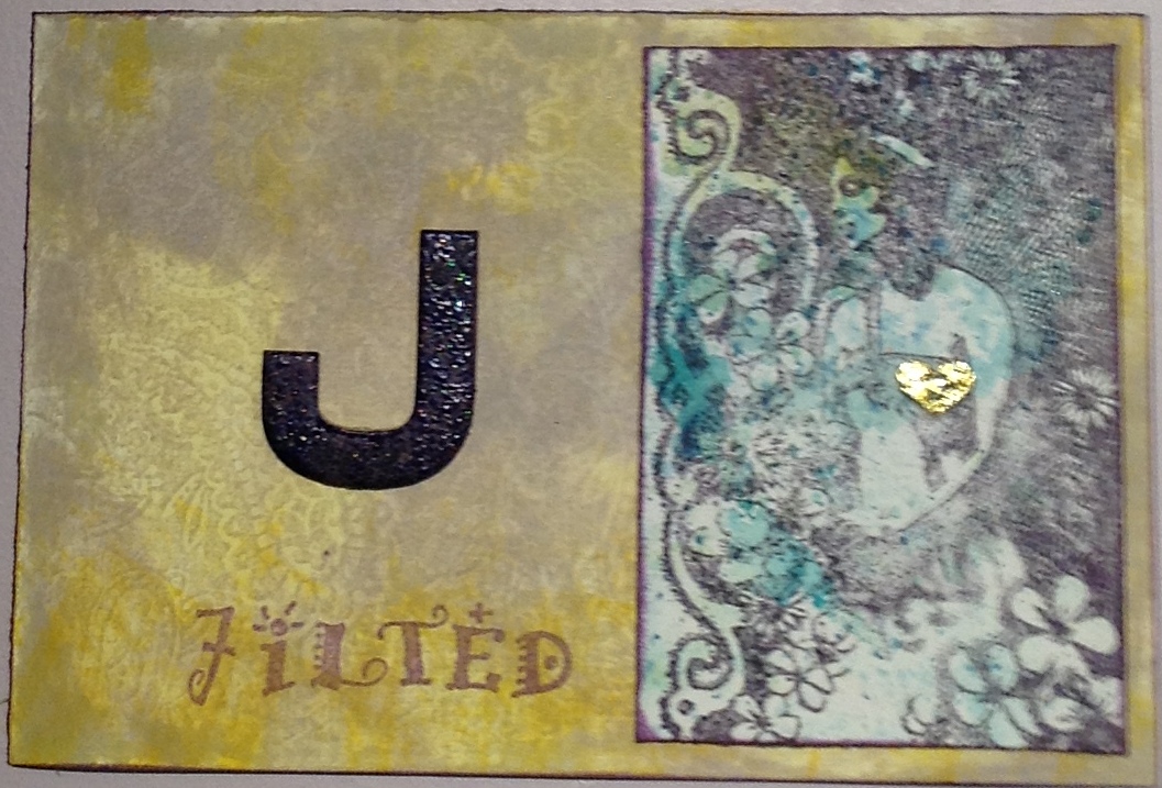
Another layer of Nickel Azo Yellow. I like this - it could get much richer with more layers and the introduction of other colours, but this peice has to be Y for Yellow, so I'd better stop. There are about 10 layers of paint here.


The back, though, well that's another matter.  I'd done everything so far (apart from the red spots)  to another piece of card to be the back of the piece.

I added layers of Nickel Azo Gold, Transparent Burnt Orange, and Transparent Iron Oxide Red.  I painted some of the gold hearts with Turquoise, very thinly. I layered in Iridescent bronze at different points so there would be different colours of gold in the piece. It looks like rich leather.


This is similar, but more deep colours added - about 17 layers of paint here.


You can make it brighter, depending on which colours you use.  Somewhere in the middle of this, there was a Turquoise layer, which turned the yellowy areas green, and the reddish areas slightly greeny browny.

This is a really easy technique which produces really rich surfaces with lots of depth and deep shine.  The trick is just to have patience, and take the time to paint many layers but keep the layers really thin, and to make sure each layer is completely dry before adding the next (use a heat gun if you're as impatient as me!).


Sunday, 29 July 2012

Alphabetica postcards

I've been organising a running Alphabetica postcard swap since January.  Here are some of the postcards I've made for the  first 10 letters of the swap.  Forgot to take pictures of all the postcards :-(

A for Art combined a gesso and Quink background with a friendly plastic embellishment and some scraps left over from another project. 'Art' is stamped and heat embossed.

I

A for Abstract is another gesso and Quink background, with another friendly plastic embellishment, and painted 'A' and some stick on letters.


E for Entrepreneurs - the Cavalieri Brothers - love this stamp.  Background is grungepaper - hate this stuff - with colourwash sprays and stamped texture.


E for eclectic, eccentric Esmerelda.  More grungepaper, with stamping, a painted letter and stick on letters.


F for Fish. A painted and stamped background, and my favourite oriental Koi stamp in gold.


F for Fossil.  Painted and sprayed backgrounds, stamped Fred Mullet fossil fish.


D for Damsel - grungepaper again, with an alcohol ink background for the Enchanted Ink image, which was stamped onto acetate with purple Stazon and backed with gold.


D for Dragonfly - more grungepaper, stamped with a Stampers Anonymous dragonfly, with an added dragonfly embellishment made of polymer clay coated with PearlEx.


I for Ice - pearlescent background and stamped letters coated with several layers of clear embossing powder with a little glitter mixed in, bent to crack it, and a few pearlescent snowflakes for good measure.


I for Inclusions - handmade paper with flower and leaf inclusions, and a variety of inclusions trapped behind gauze.


J for Jilted - Distress inks background, with a painted letter, stamped word, and stamped Crafty Individuals image.


J for Joined.  Embossed cardstock with a thin coat of Brilliance ink, layered with gold vellum and a stamped image, with added golden hearts.


Saturday, 30 June 2012

Muse paid a flying visit

I am in the middle of an Alphabetica postcard swap, but my muse has been missing, and it's been hard going. And then, she paid a flying visit...

L is for Leonardo - a man I greatly admire.  I am also rather taken with these backgrounds, which my friend Pauline taught me how to do.  It's really simple, just stroke 2 or 3 Distress Ink pads onto a teflon craft or baking sheet, spritz with water until it beads up, then dab your card around.  You can make them a bit upmarket by adding a spritz of a mica colour spray. The backgrounds are great for stamping on, they add interest but don't detract.


 I used Tattered Rose distress ink to stamp text all over the backgrounds, then Soot Black, Fired Brick and Spiced Marmalade for the rest of the stamping. These Leonardo stamps are from Rubbadubbadoo, Rubber Baby Buggy Bumpers, and Invoke Arts.


K is for Knight - one day maybe I'll find one, wearing shining armour.  I doubt it.  I used another of those Distress Ink backgrounds, and stamped a diamond pattern in Tattered Rose. I used Black Soot and Spiced Marmalade to stamp the knights with. I used a scrap of slightly glittery painted card to stamp and emboss the words (all Rubadubbadoo).


For the back of this one, I laser printed some old text, then used the same Distress Ink technique to add colour - less water this time, as I wanted stronger colour.  Also, the paper sucks it up differently to the card.  
I stamped and gold embossed the diamond pattern (Invoke Arts), then added the K (cut form Tim Holtz paper) layered onto a scrap of card with the same gold embossed pattern.


Guestbook

Copyright

Please note that I assert myself as the creator of all art on this site (unless I credit another artist) and retain copyright of all artwork posted on this site