Saturday, 30 June 2012

Muse paid a flying visit

I am in the middle of an Alphabetica postcard swap, but my muse has been missing, and it's been hard going. And then, she paid a flying visit...

L is for Leonardo - a man I greatly admire.  I am also rather taken with these backgrounds, which my friend Pauline taught me how to do.  It's really simple, just stroke 2 or 3 Distress Ink pads onto a teflon craft or baking sheet, spritz with water until it beads up, then dab your card around.  You can make them a bit upmarket by adding a spritz of a mica colour spray. The backgrounds are great for stamping on, they add interest but don't detract.


 I used Tattered Rose distress ink to stamp text all over the backgrounds, then Soot Black, Fired Brick and Spiced Marmalade for the rest of the stamping. These Leonardo stamps are from Rubbadubbadoo, Rubber Baby Buggy Bumpers, and Invoke Arts.


K is for Knight - one day maybe I'll find one, wearing shining armour.  I doubt it.  I used another of those Distress Ink backgrounds, and stamped a diamond pattern in Tattered Rose. I used Black Soot and Spiced Marmalade to stamp the knights with. I used a scrap of slightly glittery painted card to stamp and emboss the words (all Rubadubbadoo).


For the back of this one, I laser printed some old text, then used the same Distress Ink technique to add colour - less water this time, as I wanted stronger colour.  Also, the paper sucks it up differently to the card.  
I stamped and gold embossed the diamond pattern (Invoke Arts), then added the K (cut form Tim Holtz paper) layered onto a scrap of card with the same gold embossed pattern.


Wednesday, 20 June 2012

A little printing and stitching

I tried a little fun foam printing onto fabric. I cut a piece of fun foam to about 2 x 4 inches, then drew my design with a biro - pressing hard to make deep marks.


I used a sponge to apply Stewart Gill fabric paints to my 'printing plate', then pressed it onto the fabric.


I chose some really pretty perle embroidery thread, which I have been hoarding for ages, and started to embroider over the printed design. Only two stitiches - seed stitiches and french knots.


Once the hand embroidery was finished, I backed the lightweight cotton fabric with heavier fabric, and machined a small zigzag stitch around the edge.  I like the finished postcard, not at all my usual colour palette, but summery - which is more than I can say for the weather!


Sunday, 3 June 2012

Brown paper 'fabric'

Brown paper 'fabric', as outlined by Sarah Lawrence in her book 'Stitch, Cloth, Simmer & Shine', is versatile and easy to make.  I have chosen to use my sheet in a papercrafting way, but it can be sewn on too.


The first step is to get some brown paper - the stuff that comes on a roll, small bags are too thin - and scribble all over it with wax crayons.  I had some fancy wax crayons which scribble several colours at once, I used one for the top half and a different one for the bottom half. After you've scribbled, crumple and uncrumple the paper a few times, then smooth it out.


Now, rub an inkpad over the paper - it just catches the highest points.  I don't think it matters much what kind of inkpad.


Now, spray the whole thing with a dark coloured colour wash or spray ink - again, it doesn't really matter what kind - I used these from Outside the Margins because they were the only sprays I could find in my stash which were not blocked.... I tried two different colours just to see what happened.


Once dry, rub lightly all over with gilding wax - you could use Rub'n'Buff, or Treasure Gold, or Crafty Notions gilding waxes, or any other brand.  Don't put too much on, you don't want to cover all the colour up, just add a metallic gleam.


I decided to make a book with the paper, so I covered two pieces of card with the papers, added some card, and used the Bind-it-all t make my book.


The book needed an embellishment, so I stuck some of the leftover red paper to some card, and ran this through the Wizard in a Cuttlebug folder.  I die-cut it with a heart cutter, then smooshed over the raised areas with a Brilliance Galaxy Gold inkpad.  It looked OK, but there was no wow factor.  I coated it all with Versamark and added Ultra Thick Embossing powder. Suddenly, the wow was there.


I made some little circles with left over card, coated with UTEE, and added them to the cover with the heart.


March & April artwork


Ezmeralda and the Entrepreneurs are on grungepaper bases.  I hate this stuff. The only thing going for it is that it doesn't rip. It warps if you heat it, and it is darned expensive. I don't like the smell, the feel or the texture. This is probably heresy - I should just give away the sheets I have left, somebody else might like the stuff!


This is a fabric ATC, all scraps held together with free motion embroidery, then hand embellished with bullion stitch and beads.

A fluffy hanging heart, needlefelted and beaded then mounted on a collage background, painted over with gesso and pale turquoise paint.


January & February artwork

I have been neglecting this blog, but thought I'd post the artwork I've done in 2012, month by month. 


Sunday, 15 January 2012

Odd shaped art

Annie ran a swap last year, where we all made 6 little pieces of art to fit plastic pockets of an odd size - hence 'odd shaped art'. Of course, once in the plastic pocket page, we realised we needed six more to go on the other side of the page...

So, here are my second set of odd shaped art. My new scanner is very clever, and as well as scanning it does this autocrop thing when you scan several things at once. Unfortunately the autocrop feature sometimes crops the bottom off things! So one or two of these have lost their bottoms....

The first is on canvas, two image transfers (one behind the heart), and a collaged photo of a sculpture, plus a friendly plastic broken heart and some Tim Holtz music tape. The word and the (cropped) dots were done with a Viva Perle pen.


This background was watercolour paper covered with tissue and painted with a dozen or so thin layers of acrylic paint - it starts to look and feel like leather. Between the last couple of coats, I scribbled with an iridescent oil pastel crayon, you can see the metallic glimmer through the paint. Then I covered almost all of it up with a Klimt image, some Tim Holtz tape, and some german scrap!


This background was made by painting cardstock generously with gesso, and stamping into it whilst wet. A quick sprinkle with salt, and a spritz with watered down Quink permanent black ink, and leave to dry. The salt dissolves a little, leaving little pitted textured areas, and the ink separates out to give patchy mottled colours. I stamped a zodiac stamp onto a paint sample, added some Tim Holtz tape and the word and dots with the Viva Perle pen.


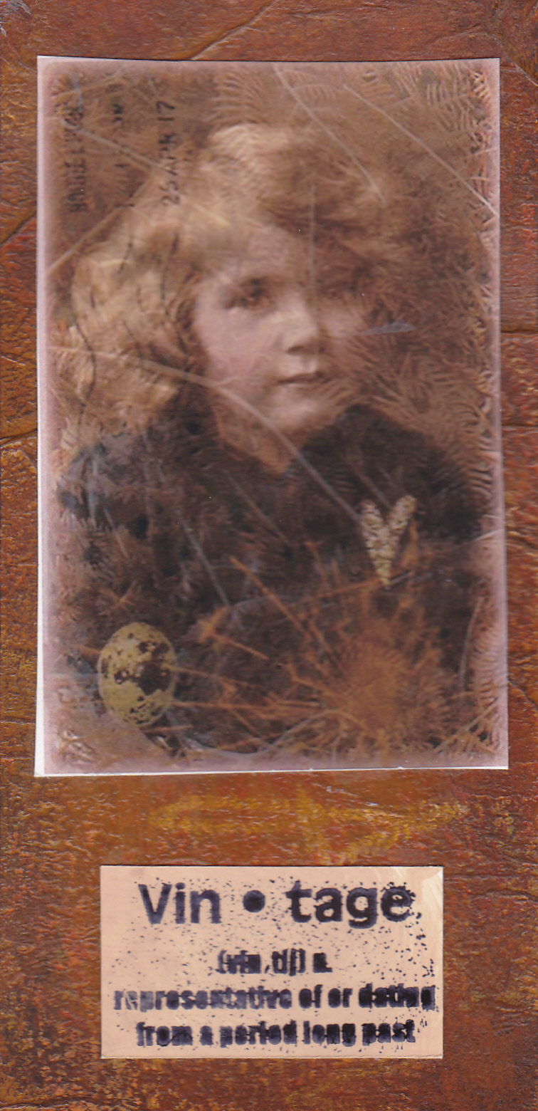
More of the acrylic paint background, this time covered with a digital collage (all my own work), and a stamped definition.


This one is really shimmery in real life - shame the scan never captures that. Moonshadow sprays on watercolour paper, with interest added by sponging acrylic paint through a sheet of ironed angelina. I added a stamped image (Stampers Anonymous), some german scrap, and some letters.


Finally, the background to this is made by crumpling waxed paper, ironing it onto glossy cardstock, then sponging dye ink on. The wax resists the ink, and creates this lovely pattern. I've had this image for ages but never found anywhere to use it. The background colours reminded me of India, so it seemed appropriate to use it at last. I punched three flower shapes out, and backed the holes with some pearlescent pinky red card, and added some sari ribbon. Clever autocrop chopped the bottom off!


Thursday, 5 January 2012

Brown paper ATC

I tried out a new-to-me mixed media technique for this ATC and am rather pleased with the results.

Take some brown (kraft) paper, an inch or so larger all around than your finished piece, and crumple it up. Crumple and uncrumple a few times till you like the texture.


Cut a piece of iron on interfacing to at least the size of your finished piece, and iron it on. The paper now feels more like fabric than paper, and won't tear where the interfacing is adhered.


Turn the paper over, raw an outline of your finished piece in pencil. Stick some pieces lace or other deeply textured textile on - I used gel medium to stick mine.


Take some perle embroidery thread - different weights would be nice, I only used one because an ATC is pretty small - and sew. I used stitches to ensure that the lace was anchored, and also as part of the design of my finished piece. The stitches are simple - blanket stitch, fly stitch, straight stitches and french knots.


Take some gesso and paint over everything you've done. I know, you just did all that embroidery - don't worry, it will all look good in the end!


Once the gesso is dry, paint over it with dark acrylic paint - I used Golden fluid acrylic in Paynes Grey (which I think is more of a blue!). Be sure to get the paint into all the texture - this will probably take 2-3 coats.


Once the paint is dry, rub all over with a gilding wax - I used Treasure Gold in sapphire. You could use rub'n'buff, or a Liberon product.


Finally, highlight all that texture with a contrasting colour of gilding wax - I used Treasure Copper - you need to have a very light touch for this part as you need to avoid getting the contrasting colour on the background (as far as you are able).


I'm really pleased with the end result, it has 'wow' factor - I will use this technique for other projects.


Tuesday, 20 December 2011

Beaded brooch

I have a very classy and elegant friend whose wardrobe only contains clothes in black and white.

Very clever idea, which simplifies her life, because everything in her wardrobe goes with everything else, she never even needs to think about that, she can just pick anything out and it goes together...

I decided to make my friend a Christmas gift as she has been very kind to me this year, and I wanted it to be something she'd find useful - she's not a crafter and I'm always hesitant about making things for non-crafters as I'm not sure what they will appreciate!

I finally decided to follow a pattern I'd found for a beaded flower brooch. I had no idea quite how long it was going to take me to make ( 3 evenings!!!!) and instead of going for a carefully chosen mixture of beads of one colour but different textures as the pattern specified, I thought I'd try black and white so it would go with my friend's clothes.

I often dislike projects when I've finished them, especially if they've taken some time to make. That's usually when I know they are finished! Mostly, when I look again a few days later, i like them again. This time I'm really not so sure....


Maybe it's because I'm not a black and white kind of person. Maybe because there are starker contrasts than I usually include in my pieces. Maybe it will grow on me. Maybe.

Hope my friend is happier with it than I am - but I gave it on the understanding that if she didn't like it, she isn't obliged to wear it from politeness, but can donate to the charity shop!

Wednesday, 23 November 2011

Christmas presents

I took part in a '12 days of Christmas' swap again this year. I love this swap, it needs 13 players, and each player makes 12 gifts which are swapped out by the hostess.

I open a gift a day until Christmas Eve, others save all theirs for Christmas Day!

Here are my gifts, all wrapped up and ready to mail. Usually I make my own wrapping paper too, but this year's gifts were 'plan B', as 'plan A' went pear-shaped, and I ran out of time!
I used some special handmade papers I bought years and years ago, instead, and was busy wrapping (badly) ready to mail on the way to the airport for my flight to Germany. Talk about cutting it fine.....


Plan A was needlefelted silk 'scarfettes', but the embellisher machine went on strike after number 7, and I couldn't get it sorted. I will post about those another time, but the books below were what kept me up late for a couple of nights in November (this post has been delayed until I knew everybody had opened their gifts).

The covers are made from foam board - very useful stuff, as it is light, yet strong. It comes in black and white, and takes paint well. I cut the covers to size, then coated the edges and one side with a generous coat of gesso. While the gesso was still wet, I stamped into it (wash the stamp immediately after you've done this), then left to dry.

I tore textured paper into strips and wrapped them around the edges of the covers, so that there was textured paper covering at least the first half inch of each side. I stuck the papers down with matte gel medium. Once dry, I started painting. Each cover had several layers of Golden fluid acrylic paint - the more layers you add, the more leathery the look. These covers had about 10 layers of paint.


The final steps for the covers was to line the reverse side with velvet paper to finish them off, then to highlight the stamped image and textured papers. You can use anything metallic for this step - gilding wax, iridescent oil pastels, Shiva/Markal paint sticks. I used a mixture of Treasure gold gilding wax and Sennelier iridescent oil pastels.

Finally, cut the papers to size and bind the books - I bought myself a Bind It All a few years ago, but you can just punch holes and use book binding rings. This might have been the best plan for me, because once i had punched all the papers I discovered that the covers were too thick for the Bind It All, and I had to punch every binding hole by hand.... Ho hum!

Sunday, 23 October 2011

Proverbs ATCs

Three ATCs on the theme of 'proverbs'. The backgrounds were all created by stamping glossy white card with Brilliance ink (white, silver or platinum all work), then drying with a heat gun, before using a sponge to rub dye inks over the top, then polishing firmly with a dry baby wipe.

The words are stamped onto a background paper created by randomly adding paints and spays to some cream card, and the images are stamped and embossed onto the background.


Thursday, 13 October 2011

Conjoined ATCs

Another swap, another theme.... 3 ATCs joined together in some way, so that they can stand up without any support.

I used 6 pieces of mountboard, painted with Ecopaints in Clay.

For the fronts, I stamped and embossed the left hand side of each ATC with Stewart Gill metallic copper embossing powder. The stamp is 'Stately' by Acey Deucy. I then overstamped with a Stampers anonymous stamp and Brilliance Lightning Black ink. I found 3 images, and'framed' them with very fine copper peel offs.


For the backs, I used the same two stamps, but embossed the Stampers Anonymous one, and overstamped with the Acey Deucy one. The ATCs were glued together, trapping some bronze glittery ribbon between the layers.


Tuesday, 11 October 2011

Autumnal colours mixed media postcard

Autumnal colours of browns, reds, oranges, yellows and greens... inspiration is all around me.

I made this postcard by painting some canvas with 2 or 3 colours of Golden fluid acrylic paints, then sewing small silk squares onto it using perle and metallic threads and embroidery stitches. The whole thing was mounted onto a piece of painted watercolour paper, which I swiped with a dark brown Stazon inkpad.


Guestbook

Copyright

Please note that I assert myself as the creator of all art on this site (unless I credit another artist) and retain copyright of all artwork posted on this site