Tuesday, 30 October 2012

Alphabetica T

T is for texture - always!

This postcard was easy, one side is just a selection of Golden pastes and mediums - crackle paste, fibre paste, moulding paste, garnet gel, glass ball gel, a gel with small gold mica flakes in it.  I inscribed the word 'texture' into the moulding paste, waited for it all to dry, then added a coat of azo nickle gold fluid acrylic paint, and rubbed it around with a baby wipe to thin it out, spread it round, and remove brush marks.


The second side involved metal tape.  I love this stuff - made from aluminium in various widths, with a sticky back.  It's made for builders to use on pipes and roofs, I think.

I stuck several pieces of tape onto the card, about 3 layers in all.  I created some 'rivet' marks on the left, just poking it with a pencil, and wrote the title of the page in the bottom left corenr.  I ran the whole thing through the Wizard embossing machine, using a Tim Holtz embossing folder, the dabbed it all over with Stream alcohol ink (Ranger brand). 


Alphabetica S


I thought I'd do another fabric alphabetica postcard, so this one (S) is Slashed, Silk, Stitch, Sample.

The front is very simply done, I sewed a layer of blue silk onto some orange silk, sewing from the edge of the piece to the centre in an oblong spiral. I took some sharp scissors and cut the fabric between the stitching, then wrote the words on a small piece of vilene and sewed that on.


For the stitched sample, I just sewed straight lines of embroidery stitches onto the silk, which was layered onto pelmet vilene, and sewed another vilene 'label' on.  Finally I sewed the slashed silk to the stitch sample and posted it to a friend!


Saturday, 27 October 2012

Embellisher machine experiements


About 3 years ago, a friend sent me an email to tell me there was an embellisher machine on EBay at £68 with no bids.  It was collect only, and only about 8 miles away from my office.  So I put the one and only bid  in and won the machine.  

Since buying the machine I have dabbled several times, and have made some lovely scarfettes using silk rovings embellished onto chiffon scarves, as well as a few ATCs and postcards.  But, I know I have never really explored the potential of the embellisher properly, so when I saw that Celyn Textiles was offering a reasonably priced day course near my new home, I signed up.  We explored lots of techniques, and I came home with more than a dozen samples.  

Here are some of the samples I made.


Embellished organza.  


Fancy yarn embellished onto felt.


Moving away from just fibres and fabric, you can incorporate paper into embellished pieces.  Sheila, our teacher, had a lovely piece where she had laid handmade mulberry paper onto felt, and then layered scrim, lace, fabrics and fibres on top before hand embroidering.  It was lovely, and the paper showed through holes in the scrim.

The piece below is embellished brown paper and organza.


To finish this piece off, you could machine embroider over the top, and zig zag round the edges - it would make a lovely book cover.

The next sample is a base for hand embroidery. Embellish scrim and wool rovings onto a velvet base. One day, I will add more rovings to front and back, and add hand stitching.  The colours of this piece are much nicer than my computer screen shows, and I think it will make a great wall hanging.


One simple technique is to just embellish organza onto fabric, then weave the fabric and embellish it together.  I've used two colours so that you can see clearly how it works. You could get a lot more creative in the ways you combined the fabrics than plain weaving - you could explore 'log cabin' patchwork style assembly, or plaiting, twisting, slashing and threading through.


A really simple idea, which gives a really sophisticated finish, is to embellish denim.  Velvet looks nice from the back, too - all the little bits poked through give a lovely texture.


 If you get chance to take a class with Sheila, it's well worth it - and she provides endless tea, coffee and cake into the bargain.  One of today's class had come all the way from Oxfordshire - her husband had driven and he went walking in the Black Mountains for the day whole she played with her Embellisher - which resulted in two happy tired people by the end of the day!


Sunday, 19 August 2012

ATCs


I belong to a small international ATC swapping group.  

Each player takes it in turn to be hostess, and to set the theme for that month.  Some of the themes are challenging, and it's always interesting to see how everybody interprets the theme.

These are a few of the ATCs I've made for that group this year.

The first ATC is a textile ATC, made by sewing all sorts of snippets of fabric and fibre to a pelmet vilene base, zigzagging around the edge, and hand embroidering and beading.


The ATC below was my first attempt at the theme of 'A Clear Layer'. I created a fleur-de-lys stamp by drawing on fun foam, and stamped it with a kaleidoscope inkpad. I had masked the fleur-de-lys itself, and then I sponged that shape in purple. I stamped over the fleur-de-lys with a texture stamp and gold ink.  So far so good, and lots of subtle texture and colour, all pastel and way out of my normal colour palette.

I decided the clear layer should be clear sticky backed plastic.  I snipped some angelina fibres, and scattered them over the ATC before sticking down the plastic.  And then I realised the plastic stopped all the subtle texturing I'd done being visible. Harumph. It just looked really ordinary.

I decided to try and improve things. I drew round the fleur-de-lys shape with a bronze Viva perle pen, and used a white one for the rest of the design.  

I left it a few hours.  

I drew dots around the edge.  

I left it a few hours.  

I drew dots in the middle. 

It was better, but I still wasn't happy.  I ditched it.


Clear layer 2nd attempt.  I took some cardstock, and made a background by smearing some Distress ink onto a craft sheet, spritzing with water, and 'smooching' the card through the ink.  This makes a lovely unpredictable background which is very useful for ATCs. Once I had my background, I created a digital collage in Photoshop, in similar colours to my background. I had some clear digital letters (Tangie Designs)so added the word at the bottom. Once printed onto my background, I stamped the flower, and smeared a trace of Stickles around. I then printed the text and butterfly design (Tangie Designs) onto inkjet acetate, and added it to the ATC using brads. I am much happier with this.


Zettiology ATC.  I'm not a huge fan of zetti, although I see things which other people have done and which I quite like. I did once take part in a huge journal pages swap, which was kind of zetti and which I enjoyed, but mostly it doesn't come naturally to me.

I was very fortunate, because my friend Chrissy took the time and trouble to send me a birthday card, and the card she sent was a zetti design.  I liked her design, so created a small adapted version in this ATC. The black background has been embossed in an embossing folder, and the 'body parts' are all shrink plastic.  The rest of the design elements are hand drawn with a white pen.


Saturday, 11 August 2012

Wedding Cake

My stepdaughter was planning her wedding.  

I had made a wedding cake for her sister some years ago, (see the spiky cake in this post) so offered to do the same for her.  

I only make wedding cakes for family or close friends, or if somebody has twisted my arm a long way up my back.  

I enjoy the process of decorating special cakes, and certainly enjoy the challenge of making something unusual, but am always very aware that it's a big occasion and if I get it wrong it will spoil things for the bride, so it can also be stressful.

I sent the bride a selection of images to get her thinking about kind of cake she might like, 
and she fell in love with a cake by Maggie Austin.  

Well, as Maggie Austin is in the US and we are in Wales, we clearly couldn't buy the cake from Maggie.  I had a good look at the image on Maggie's website, and thought I had a fair idea of how it might have been made.  I contacted Maggie and asked if she could confirm my thoughts, so that I could try to make something similar, as it would not be possible for us to be customers. Both Maggie and her sister were really kind and helpful - and it turns out that they had spent some time near Aberystwyth and really loved it, so there was a link to Wales...

The bride wanted chocolate cake, the groom wanted chocolate orange, and there had to be a fruit cake too. I made a 12 inch chocolate fudge cake - the biggest cake I've ever made, I had to mix it in a washing up bowl! I also made a 10 inch chocolate orange cake (experimented with this, it tasted yummy), and an 8 inch fruit cake, which was well drizzled with armagnac - weekly, for several weeks.

All I can say about the way the cakes tasted is that there were trimmings from levelling all the cakes before icing them, and I and my son and his family did some quality control. We don't think any of the guests were likely to leave cake on their plates.

I covered all three cakes with 
fondant icing - I did wonder if Maggie's cakes 
are covered with frosting of some kind, because that would make it easier to attach the decorative icing.  


The cake is decorated by attaching strips of icing. All the strips of icing have a blushed edge, and most are slightly ragged - blushing and distressing added quite a bit of time to the process. I 'glued' each of the 200 or so strips on with royal icing. This work has to be done in small batches, as the icing dries out quite quickly. The completed top tier (above), was my 'test piece'. I was happy enough with it to carry on...

As you can see from the photos, the icing is graduated in colour from top to bottom, which meant mixing the right green to tone with the bridesmaids dresses, then adding more and more white until I had 6 shades of green. 


On the day of the wedding, I loaded the cakes into large boxes and took them to Clearwell Castle, where the reception was being held. Needless to say, by the time I arrived, there was a little damage to one or two of the strips of icing - done getting the cakes in and out of the boxes rather than damage caused during the drive.  

I was glad I had taken my cake 'repair kit' with me.  It took me about 45 minutes to assemble the cake, make the repairs, add the ribbon to the bottom, and position the flowers.  The flowers were fresh, and individually wired.  Ideally, there should have been a few more of them, and they should have been a bit bigger, but they look pretty good.

The bride and I had decided a clear glass stand would make the cake look as if it was floating, but the maitre d'hotel needed reassurance that it was strong enough....


I loved the way the cake looked, but the location made it impossible to get a photo of it without something distracting in the background!


This is probably my favourite picture. I'm thinking this is the view the bride and groom had when they cut into it.  Wonder how they felt when they did that?

Thursday, 2 August 2012

Alphabetica M, N, O postcards

M is for multicoloured.  I punched little flowers from lots of odd bits of handmade backgrounds.  In my mind's eye this was much prettier LOL.  Think I should probably have started with a circle and worked out.


M for mosaic - stamped on a handmade background, using a bit of fun foam stuck on the end of a chopstick!


N for nautical - a Queen Anne's Dresser sailor stamp, with some seashells and texture.


N for nature - this one came out better than I'd hoped - a Distress Ink background, stencilled with modelling paste.  Stencil by Crafters Workshop, coloured with Brilliance inks, Adirondack inks, and a little Treasure Gold here and there.


O for organza.  Pelmet vilene base, sprayed with colourwashes, then layered with organza scraps and hand stitched.  A little label - moulding paste spread onto cardstock, scratched into, and painted with fluid acrylics once dry - and a few sequins & beads.


O for organza - layered organza, scored with a soldering iron, beaded and hand stitched, a la Margaret Beal.


Tuesday, 31 July 2012

Charms


These charms were made very simply from shrink plastic, then mounted onto tags.

I ran white shrink plastic through the Wizard, with a heart die cut.  I added a little deep green/blue colour with a pigment pad and rubbed it around with my finger till it was subtle. I punched the hole.

I stamped the oriental lady (Stampington) on one side and the oriental pattern (Stampers Anonymous) on the other, using turquoise Stazon, then shrank the plastic.

Once shrunk, I edged the hearts with the turquoise Stazon, added a couple of jump rings and a leaf , then attached the charms to the tags.


The tags were made by rubbing distress in ks onto a craft sheet, then spritzing until the ink 'beads'.  

I pressed the tags into the ink, several times, drying with a heat gun between layers of ink.  I then used a Cratfters Workshop stencil and moulding paste to add pattern and texture, and ran a distress ink pad over the top.  

I stamped 'charmed' onto a some scrap card, added fibres, and was happy with the result. Hope my swap partners like them!

Button tags

I made these tags for a handmade button on a tag swap. The buttons are made from polymer clay.


I mounted the orange buttons onto paper flower shapes which I'd overstamped with some text.  The tag background was made by smearing distress inks onto a craft sheet, spritzing, and dipping the tag into the ink. Do this several times, drying the tag in between.  I then used a Crafters Workshop stencil, and moulding paste, to add patterned texture.  I ran an inkpad over the top to catch the detail, then added a bunch of fibres.

The tag below was made the same way.


Sunday, 29 July 2012

Alphabetica postcards

I've been organising a running Alphabetica postcard swap since January.  Here are some of the postcards I've made for the  first 10 letters of the swap.  Forgot to take pictures of all the postcards :-(

A for Art combined a gesso and Quink background with a friendly plastic embellishment and some scraps left over from another project. 'Art' is stamped and heat embossed.

I

A for Abstract is another gesso and Quink background, with another friendly plastic embellishment, and painted 'A' and some stick on letters.


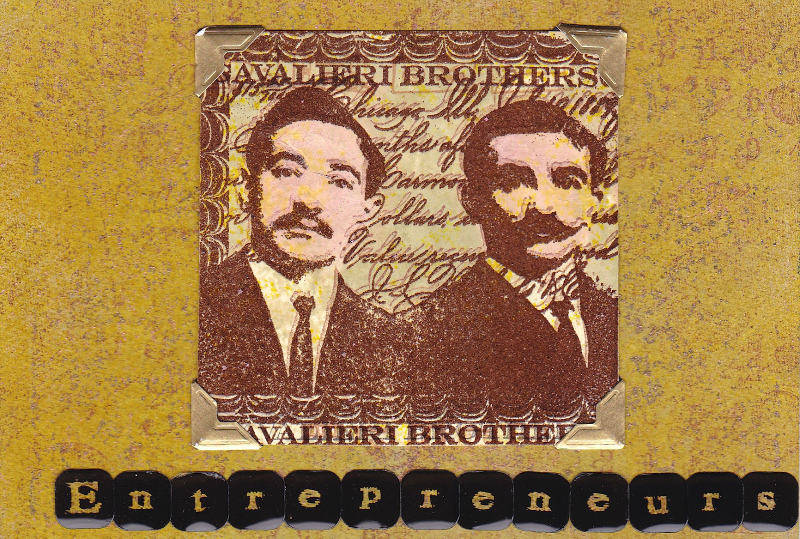
E for Entrepreneurs - the Cavalieri Brothers - love this stamp.  Background is grungepaper - hate this stuff - with colourwash sprays and stamped texture.


E for eclectic, eccentric Esmerelda.  More grungepaper, with stamping, a painted letter and stick on letters.


F for Fish. A painted and stamped background, and my favourite oriental Koi stamp in gold.


F for Fossil.  Painted and sprayed backgrounds, stamped Fred Mullet fossil fish.


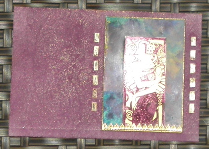
D for Damsel - grungepaper again, with an alcohol ink background for the Enchanted Ink image, which was stamped onto acetate with purple Stazon and backed with gold.


D for Dragonfly - more grungepaper, stamped with a Stampers Anonymous dragonfly, with an added dragonfly embellishment made of polymer clay coated with PearlEx.


I for Ice - pearlescent background and stamped letters coated with several layers of clear embossing powder with a little glitter mixed in, bent to crack it, and a few pearlescent snowflakes for good measure.


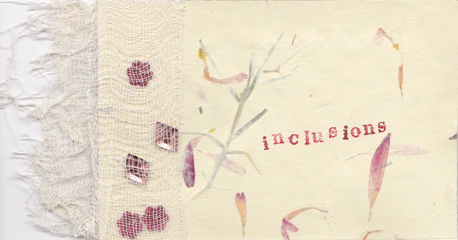
I for Inclusions - handmade paper with flower and leaf inclusions, and a variety of inclusions trapped behind gauze.


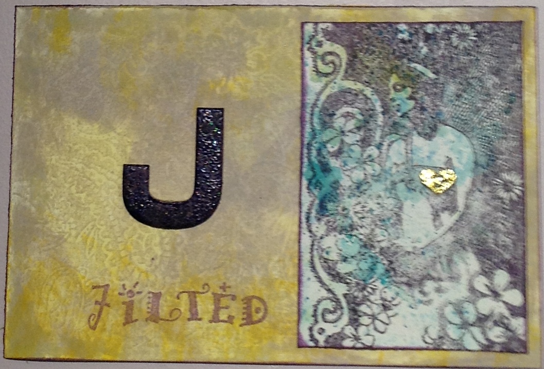
J for Jilted - Distress inks background, with a painted letter, stamped word, and stamped Crafty Individuals image.


J for Joined.  Embossed cardstock with a thin coat of Brilliance ink, layered with gold vellum and a stamped image, with added golden hearts.


Saturday, 30 June 2012

Muse paid a flying visit

I am in the middle of an Alphabetica postcard swap, but my muse has been missing, and it's been hard going. And then, she paid a flying visit...

L is for Leonardo - a man I greatly admire.  I am also rather taken with these backgrounds, which my friend Pauline taught me how to do.  It's really simple, just stroke 2 or 3 Distress Ink pads onto a teflon craft or baking sheet, spritz with water until it beads up, then dab your card around.  You can make them a bit upmarket by adding a spritz of a mica colour spray. The backgrounds are great for stamping on, they add interest but don't detract.


 I used Tattered Rose distress ink to stamp text all over the backgrounds, then Soot Black, Fired Brick and Spiced Marmalade for the rest of the stamping. These Leonardo stamps are from Rubbadubbadoo, Rubber Baby Buggy Bumpers, and Invoke Arts.


K is for Knight - one day maybe I'll find one, wearing shining armour.  I doubt it.  I used another of those Distress Ink backgrounds, and stamped a diamond pattern in Tattered Rose. I used Black Soot and Spiced Marmalade to stamp the knights with. I used a scrap of slightly glittery painted card to stamp and emboss the words (all Rubadubbadoo).


For the back of this one, I laser printed some old text, then used the same Distress Ink technique to add colour - less water this time, as I wanted stronger colour.  Also, the paper sucks it up differently to the card.  
I stamped and gold embossed the diamond pattern (Invoke Arts), then added the K (cut form Tim Holtz paper) layered onto a scrap of card with the same gold embossed pattern.


Wednesday, 20 June 2012

A little printing and stitching

I tried a little fun foam printing onto fabric. I cut a piece of fun foam to about 2 x 4 inches, then drew my design with a biro - pressing hard to make deep marks.


I used a sponge to apply Stewart Gill fabric paints to my 'printing plate', then pressed it onto the fabric.


I chose some really pretty perle embroidery thread, which I have been hoarding for ages, and started to embroider over the printed design. Only two stitiches - seed stitiches and french knots.


Once the hand embroidery was finished, I backed the lightweight cotton fabric with heavier fabric, and machined a small zigzag stitch around the edge.  I like the finished postcard, not at all my usual colour palette, but summery - which is more than I can say for the weather!


Guestbook

Copyright

Please note that I assert myself as the creator of all art on this site (unless I credit another artist) and retain copyright of all artwork posted on this site