The young man who helps me at work is getting married. He and his wife-to-be have been planning the wedding for a long time and I know they both want it to be a really special day. I really appreciate all David's help, but I probably don't show or tell him that enough, so thought I'd make them an album as a wedding gift. They can choose whether to send the album around for their guests to write in during the wedding reception, or whether to use it as a photograph album.
I made the covers from mount board covered in felt, and fabric paper. The mount board is in one piece for the back cover, but the front cover consists of one piece about an inch wide and another which is the rest of the cover. Once covered with fabric, the joint between these two pieces will allow the front cover to be opened easily.
The fabric paper is simple to make - take a piece of woven cotton fabric, and glue pieces of printed tissue paper and thin gift wrap onto it, using watered down PVA glue (about half water, half glue). Leave small gaps between the papers so that the fabric isn't too stiff when it dries. Although I usually use random pieces of gift wrap and printed tissue, I chose both the colours and the images of the gift wrap quite carefully for this project - they are all birds, cupids, medieval patterns, romantic quotes, or abstract gold and white patterns. This way, whatever shows through after decorating the covers, will be appropriately romantic.
Next, cover the printed papers with strips of plain cheap white tissue, using the same glue mixture. It doesn't matter if they overlap, or crinkle, this will add to the overall texture. Before this layer dries, paint the whole piece with a wash of very diluted acrylic paint. I like to use Golden fluid acrylics, as they are so heavily pigmented that there is still quite a depth of colour even when diluted. I used a turquoise and a violet on the fabric paper. Leave paper to dry - I hung mine on a washing line and left it overnight.
I cut the covers to size, allowing an inch all around for finishing. I decided it needed a touch of glimmer, so gave it a wash of watered down Jaquard Lumiere paint in purple gold. Once dry, I used the sewing machine to add gold organza ribbon, and patterned satin ribbon which I had dyed lilac. I added some frilly turquoise ribbon down the side where the album hinges. I then sewed and glued the remaining elements onto the cover by hand. Each square sequin has a bead and 4 stitches holding it in place, the satin ribbon is decorated with seed beads, there are bugle beads forming vertical interest, a polymer clay key, a heart plaque made using water soluble paper to cast a stamp, punched paper hearts, stamped and embellished with small flowers, fabric flowers attached with gold brads, and the names of the happy couple stamped above and below the heart plaque. The areas where there is no added embellishment are where I have allowed background elements to be seen - there are two quotes - Love conquers all and My heart for ever more, and the birds on the nest in the centre.

The back cover is much plainer, I just added gold organza ribbon around the edge.

There are 15 pages inside the album. My scanner isn't showing the detail too well, but both sides of each page was washed with delicate pink and blue watercolour dyes, and the right hand edge was stamped with Colorbox lavender pigment ink. Finally, each page has part of a text called 'The Art of Marriage' stamped onto it.

The whole text reads:
The Art of Marriage
A good marriage must be created
In the marriage, the little things are the big things.
It is never being too old to hold hands.
It is remembering to say "I love you" at least once a day.
It is never going to sleep angry.
It is having a mutual sense of values and common objectives.
it is standing together and facing the world.
It is forming a circle of love that gathers in the whole family.
It i speaking words of appreciation and demonstrating gratitude in thoughtful ways.
It is having the capacity to forgive and forget.
It is giving each other an atmosphere in which each can grow.
It is a common search for good and the beautiful.
It is not only marrying the right person, it is being the right partner.
I wish David & Laura a long and happy marriage.
I made this piece for a swap Sweetpea is running on CC Swaps. The swap requirement was that whatever we made had to be inspired by or in the style of Beryl Taylor. I love Beryl's work and have made several paper quilts in the style of her work. I decided to be a bit more ambitious and adventurous this time, and go for a fabric paper and embroidery project.Fabric paper is a fabulous base for mixed media - and very simple to make (although it does take a long time to dry). You just take a piece of fabric - gauze or fine cotton - and paint it with watered down PVA white glue (the cheaper the better). Lay some scraps of tissue paper or thin gift wrap down onto the fabric and paint with more glue. Leave gaps between the scraps. Add torn strips of white tissue paper along with more glue, to cover the whole thing. While the glue is still wet, add a wash of watered down fluid acrylic paints in 2 or 3 colours. Leave to dry overnight.I glued my fabric paper to a layer of felt, then cut nine 2 inch squares from the sheet. I machine stitched around the edges of each square, using gold thread. I stamped some medieval text onto the squares using Stewart Gill Metallica bright gold paint applied to the stamp with a colorbox sponge tool. I edged the squares with more paint. I took a square of mount board and covered it with velvet, then mounted my squares onto it with gel medium. Having created a background, I needed to add the decorative focal point to the piece. I wanted this to stand out from the background, so applied a thin layer of white gesso over my fabric paper. I hand drew a design copied from a medieval tile from Strata Florida Abbey, the resting place of several Welsh Princes, and cut it out from the fabric paper. I layered it onto some deep blue-green fine netting, machine embroidered the centre, and the outer ring, then hand embroidered the cut out using gold thread, and added some beading. The photo below shows the piece with the gold thread work almost complete but not yet beaded.
 I cut small diamonds from fabric paper and painted them with a coat of transparent iron oxide, then added them to the circle around the design, with a bead in the centre of each. Finally, I mounted the circular piece onto the squares background. The background squares are much more vivid than the picture shows, and I'm really pleased with the finished piece.
 I hope Sweetpea likes it too!
I've been playing with texture on canvas. I've learnt that working on two at a time is a good thing - while you are working on one, the other is drying and vice versa.
I added texture using a range of Golden products - coarse & fine garnet gel, light moulding paste, clear granular gel, pumice gel, fibre gel medium and clear tar gel dribbled on last - that's what makes the raised 'veins' you can see on both canvases. I am learning that as well as adding texture, each of these products takes the paint slightly differently, adding to the textured effects.

Once the canvases have all the textures added, and all the products have dried (several hours, leaving them overnight is easiest for impatient artists!), I added 2 thin coats of raw umber fluid acrylic paint. For the canvas above, I then added interference oxide violet and interference oxide green fluid acrylics. For the one below, I just dabbed a little bronze here and there. The final touch for the backgrounds was to add a little Treasure Gold to the high points - I used Amethyst on the canvas above, and Onyxite and Classic Gold on the one below.

The images on these canvases are made of Friendly Plastic - the top one was made using scraps in a mould I made from a milagro ornament, then given a rub of Treasure Gold Amethyst and highlighted with Classic Gold. The bottom canvas has a 'shrine' made from Perfect Paper and a rubber stamp, coloured in the same way as the background, with an art nouveau head made in a mould, coloured the same way as the background.
I thought I'd make something in the style of Beryl Taylor for Jacqui's birthday, as I know Jacqui loves Beryl's work. I've made paper quilts in this style before, but I thought I'd stretch myself a bit by moving out of my colour comfort zone and have a try at using pastels in the way that Beryl does. Beryl's colours always look so pretty, and I don't do pretty that well!
I used good quality watercolour paper - Fabriano Artistico Aquarello hot press. I cut and tore the paper, then brushed it with water before spraying with 3 colours of Sticky Fingers colour wash sprays - lilac, aqua, and pink. The water helps the colours blend where they meet.
I gave the main background area a very thin coat of watered down gesso, as I thought it was a bit bright. This was nearly a disaster as of course, the base layer of colour is water based, and adding thin gesso was not a good plan as it started to lift the original colour! I dried it as quickly as I could before all the colour disappeared. Once dry, I stamped down each side using Stewart Gill paint and a grungy Fleur-de-Lys stamp.
I cut a piece of the original darker coloured paper to go across the top, then punched flower shapes out of it. I attached the top strip with brads, adding a layer of organza to soften it. I punched some tags and inchie squares from the darker paper, and embossed them in cuttlebug folders, along with a piece for the bottom. I used the flowers I'd punched from the top piece to decorate the tags and added these plus a couple more flowers to the right hand side, using brads. I sewed the squares down the left hand side, adding square sequins and blue beads.
For the main central panel, I coated some of the paper with gesso and added Stewart Gill Fresco Flakes. The white flakes looked a bit stark, so I gave them a coat of watered down aqua colourwash, then sealed the flakes and colour with soft matte gel medium. I made a frame using water soluble paper and a rubber stamp, then painted it with pink paint, and added Treasure Gold in Aqua and Whitefire. I stuck the frame onto a slightly distressed image transfer (made using water and an inkjet print in the Wizard), and added these to the Fresco Flake background. I sewed some buttons top and bottom, adding 3 gold beads to each.
 For a final touch, I stamped and decorated some tags, and added them all to the bottom of the quilt, using two eyelets.
I am not sure this quilt is finished yet, I think it may need a thin ribbon down the side and possibly a horizontal element or two on the Fresco Flake background. I'll leave it for a day or so to make up my mind. Please feel free to make suggestions using the comments box!
I did add a few small gold sequins here and there, just to make it look a little more 'finished'. Sorry the picture is a little fuzzy. See if you can spot the difference!

Well, my meander pages are at an end. This has been a really fun project, which made me get my scary sewing machine out and USE it in my art. I still need to try free motion embroidery (which is what I wanted a new sewing machine for 18 months ago LOL) but at least I have dabbled a little by sewing images onto pages, and edging them with a variety of stitches.
Having said that, this page, the last one, doesn't have any sewing on it at all! Jessie sent a lovely textured page in browns and purples, and set her theme as 'vixens'. I thought the other players would probably go for vampish images, and when I looked at what I had I was a little torn between an angry looking vamp and a topless child who was clearly a vixen in training! I decided on the angry vamp, as she had something about her which really appealed to me.
I went for a really simple page design, centreing the image and covering it with a small sheet of mica, held in place with a couple of brads. I trimmed with German Scrap, which I dulled down with Treasure Gold (I seem to use it on every project these days!), and decided it didn't need another thing!

I hope Jessie likes it!
Carol sent me a beautiful shimmery lavender page to decorate, and set her theme as 'faces'. I immediately knew I wanted to use this transparency, but when I laid it onto the page, there wasn't enough contrast for the face to show clearly, it just disappeared into the background. After playing with a few other ideas, none of which I liked as much, I decided I really wanted to use the transparency so needed to increase the contrast. I painted the centre of the page with some pearl coloured paint, and blended the edges in. I trimmed the transparency, and sewed it in place with gold thread. I sewed the heart on, and added beads in similar iridescent colours to the background. Carol will be binding this page at the left and bottom, so I left those areas clear.  The design is quite simple, but I'm pleased with it! I hope Carol likes it too.
Margaret set the theme for her 'It Girl' gift as 'cemetery angels'. Now, I love cemetery angels, and have had many many ideas about what to make for Margaret over the last few months.I got up early this morning, with every intention of doing an image transfer and making it the focal point on a bag. And then I got hung up on - What kind of bag? What kind of fabric? What colour? How big? With a zip, or not? Handles long enough to go over your shoulder or just over your arm? I decided to forget the bag and make a small pillow using the transfer. I went and got the image of the angel to do the transfer, and while I was reaching for it, I spotted this shrine box....The rest is history! I wanted the box to look old and patinated, so I painted the front and inside with Stewart Gill Metallica paint in pewter (not that any of it is visible!) and sprinkled with marcasite and also lead patina embossing powders (also Stewart Gill). I heated with my heat gun, and the paint bubbled and the embossing powder melted, and they combined to make a really nice old and weathered texture.I had a small angel charm, which was very bright brass, so I painted it with micaceous iron oxide paint, and then gave it a rub with Treasure Gold indigo. I really do use TG on every project these days - I don't know how I ever managed without it! I stuck the little angel on the front using polyurethane glue. Hope it doesn't fall off! Now for the inside - I glued my angel image to some stiffer card and cut her out. I gave her two thin coats of soft gel medium and stamped into it before it dried - using a sort of 'halo' stamp. I gave her a light touch of Treasure Gold in pewter, which picked up the texture. I glued a small piece of torn text form a Welsh Bible and stuck it to the back of the shrine. I dribbled PVA glue into the bottom corners, and sprinkled it with 'Flower Soft' - I bought this stuff when it came out and have never used it before, but it looks like old dried lichen in the shrine.I used foam pads to add the angel, holding her a little away from the back of the shrine. I used sticky dots to hold a small piece of picket fence in place (bought in Michaels or Joannes back in 2007!!) and another sticky dot to hold some small fabric roses to the fence.
 She'll fly off to California soon, I hope Margaret likes her!
More mixed media meanderings. This bluey green page streaked with gold arrived from Rachel, with the theme of 'wings'. I sewed some blue and green organza to the page with gold thread, which added a nice sheen, and then thought about the focal point.
I considered all sorts of options, and decided not to use an image, but to make a butterfly, and sew it on with the wings free of the background.
I sprayed some pelmet vilene with Radiant Rain, and when it was dry I die cut it using a cuttlebug die, and ran it through the Wizard again in a matching cuttlebug folder. I liked the texture, but it was very subtle. I added several coats of Treasure Gold to the high points to bring out the texture. I sewed the butterfly onto the page, then beaded the 'body' with iridescent beads.
To make the words, I coloured some Tyvek with Brilliance ink, and stamped the letters with black Stazon. I chose the words because they are the name of Rachel's blog. I cut the words out and sewed them onto the page, and finished the page off by sewing 3 little butterfly charms on.

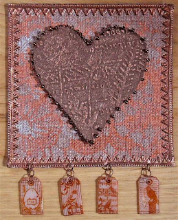
This page, for Wendy, came in various metallic shades, including copper. The theme is vintage. I painted the background with Stewart Gill metallica paint, using a doily as a stencil. I darkened some German scrap with Treasure Gold, and stuck it on.
For the main embellishment, I decided to create an old fashioned and weathered looking heart. I sprayed some pelmet vilene with Expresso colourwash spray, and once it had dried I die cut it and embossed using a cuttlebug die & embossing folder in the Wizard. I rubbed over the raised areas with copper Treasure Gold (looks much brighter in real life), backed it with felt, and beaded around the edge.
To finish the page off, I made some shrink plastic charms, and added them with some small copper jump rings.
Mawgan's page was green, with a nature goddess theme. I gave it a couple more coats of different greens, then stamped and embossed some oak leaves in deep green pigment ink.
I made a goddess from Friendly Plastic in an Enchanted Gallery mould, then turned it over, laid the green organza in top and added a hot thin piece of friendly plastic to bond the fabric to the embellishment. Um, this took 3 tries, I tried to use a heat gun to soften the moulded piece so as to press the organza into it. This resulted in one ruined embellishment and two ruined pieces of organza. I decided there is no safe distance for a heat gun and organza!!!
Finally, I sewed the organza to the page using gold thread.

Finally, I worked on Trish's page. This was orange and yellow when ti arrived, but Trish wants her book to be BRIGHT, so I decided to add a splash of hot pink. Somewhere along the way I lost the yellow and some of the orange, too. I hope Trish doesn't mind! I added bright silk paper and paint to the page and decided that although I liked it, it wasn't working as a background, so I turned the page over and began again.
I used some Radiant Rain in a bright pink to spray over a Heidi Swapp mask, which left a pretty indistinct pattern, but as all I wanted was to break the plain orange up with some pink, that was fine.
I painted some glossy cardstock with pink and orange paint, and stamped the text onto it with red Stazon. I stuck it to the page with a glue dot, then covered it with a layer of shocking pink organza shot with gold. I sewed this on with gold thread, then cut the edges in a raggedy style - if Trish wants them neat, she can easily trim this off. To finish, I added a very bright shell button and some beads, using fine invisible thread.

More meander pages, these are 4 inches square with a pelmet vilene base coloured by their owners, and this one's for Fiona, on her theme of 'plants/flowers':

Wales had fantastic weather yesterday, so I sat in the garden and did some needle felting. I used a metal cutter in the shape of an oak leaf, and some blue mohair yarn, and felted inside the cutter. I added some viscose roving in paler blue & green, and felted that in, then spent some time beading the oak leaf. I stamped and embossed the page, added the leaf and finished it off with some tied yarn and ribbons. I hope Fiona likes it.
This one had to be made indoors, as it involves fusing fabrics with a soldering iron:

Pauline H's theme is sea and sky, I cut various colours of organza, layered them and used the soldering iron tip on my Versatool to fuse them together in a wave pattern. I painted the fabric with Stewart Gill Galactica paint in holographic silver (it has a lovely subtle twinkle in real life, like the sun shining on the sea). The sun is moulded air dry clay, and the mermaid is moulded Friendly Plastic. I finished the embellishments off with Treasure Gold, to take the high shine off them and integrate them into the piece, and finished the page off by dangling some seashells. I hope it reminds Pauline of summer seas and skies, and that she likes it.
This is Jacqui's page, she has chosen the them of 'vintage', which is something I always struggle with. At least with paper I have learnt that Distress Inks make things look vintage, but fabric is another matter. This is my take on it:

I stamped and embossed the grey/brown background Jacqui sent me, using Moonglow copper obsidian. I created a frame out of purple fun foam - heated, stamped into while hot, painted with Stewart Gill fabric paints, rubbed over with Treasure Gold - and stuck a transparency and the frame onto the page. I finished this page off with a dangly heart. I'm not sure if this is the kind of thing Jacqui had in mind, but it's my take on vintage! I hope she likes it.
Finally, Pauline C chose 'nature' as her theme, and sent me a lilac page. Hmmm. My nature is rather unnatural! I sprayed the back of the page with a deeper colour, using some flower shapes as stencils, but it didn't inspire me, and it was too strong to use as a background. So, I covered the front with lilac organza, and made some flowers and leaves using fusible film. I sewed the leaf and flowers onto the organza, added some bead flower centres, and then took some gold Stickles and added a glittery gold edge and some random dot patterns. I hope Pauline likes it.

Here is another meander book page - also for Annie, whose theme is 'play on words'. Annie provided the ready coloured background, which is textured with embossed writing.I cut out some heart shapes from felt, laid them on larger organza heart shapes then needle felted silk, mohair and synthetic fibres onto the hearts. The words are stamped onto tyvek with Stazon ink, and coloured with Brilliance ink. I did get the needle and thread out to sew some small gold beads around the edges of the hearts. It was quicker to make these needle felted pieces than do all that embroidery!!!
I'm involved in a round robin meander book swap. We have chosen to use pelmet vilene or canvas as the base of our 3.5 inch pages, which are mixed media. Each player has coloured their pages, and set a theme, and sent two pages out to each player. When we get our pages we are to decorate both, keep one and return one, so we will each end up with two meander books - one of our own pages for everybody else's books, plus one of everybody else's pages for our own book. Make sense? See Cloth paper scissors issue 5 Winter 2005 for mixed media meander book example and instructions.
Eva chose her theme to be 'rainbow' and has sent a different colour to each player. I got red. Eva wanted texture, but no words. I painted a paper doily, and stuck some of that on the page, then added some Stewart Gill gilding flakes (very shiny!) and made two textured hearts from Friendly Plastic (ironed between silicone baking paper till thin, then stamped into, and finally re-heated and cut using a small cookie cutter). I covered the wholepiece with red organza, and used french knots and fly stitch to 'trap' the hearts and hold the layers together. It's been a while since I embroidered!

Annie send some very subtly coloured pages, and set her theme as 'birds'. I printed a bird I created earlier in the year, and ran the print (coated with gel medium) through the Wizard to create an image transfer.

I used gold machine embroidery thread to sew an eye, the beak, and an outline - all by hand.

I added some green and purple organza 'feathers' to the tail.
 I added 'feathers' to the wing, fly stitch to give the body texture, a few french knots for interest, and blanket stitch all round to finish the edge off. It took me AGES. I managed to tangle all the threads. I now remember why my interest in embroidery didn't last too long last time I dabbled!!

I hope Annie likes it.
Just a couple more simple pieces of jewellery that I made form my polymer clay brocade sheet and some silver findings. These are on their way to Debra & Pattie. I hope they like them.
I've been playing with texture here. I took this mini 4 inch by 3 inch canvas, and dribbled some clear tar gel onto it. I also added clear granular gel, and some fibre paste. I left it all to dry overnight, then painted it with a coat of burnt umber fluid acrylic. Once that was dry, I painted it with interference green fluid acrylic, and a few areas of interference violet. Finally, I stroked Treasure Gold all over the canvas, bringing out all the high points. I used heavy gel medium to add Da Vinci's self portrait in the polymer clay frame, which was made in a Krafty Lady mould, dusted with Pearl Ex.

I hope Liz likes it!
This piece was made for an 'old and new' swap on CC Swaps, where we needed to use something that had been in our stash for a long time (in my case the jump rings, memory wire and clasps) with something new (the pendant I made) and include stamping (on the pendant).

I'm not telling you how I made it yet, it's a bit of a mystery!!!
It's off to the Philippines, where I hope it's new owner enjoys wearing it.
I was reading Donna Kato's 2nd book on Polymer Clay (Surface Effects for Polymer Clay), which I can highly recommend as having great eye candy and clear instructions, when I came across 'polymer clay brocade' and fell in love.
I've really enjoyed making these pieces, and thought I'd share how I did them.
First, gather your supplies - you'll need:
a ceramic tile or piece of silicone coated baking paper to work on
a pasta machine or Wizard die cutting machine if you have one (but you can knead the clay by hand if you don't)
black polymer clay - preferably Kato or Fimo
metallic acrylic paint, plus 3 colours of acrylic paint
rubber stamps - deeply etched with all over texture or pattern rather than images (you could also use texture plates, or perhaps even an opened out Cuttlebug folder)
cornstarch, talc or similar for dusting
rolling pin - preferably acrylic or brass rod or acrylic brayer but I managed with a glass bottle!
metal cookie or similar cutters if you have them
The very basic instructions for the technique are really very simple, as follows:
Condition clay and roll into sheets. Paint clay, and impress with a stamp. paint clay again, and roll flat. Cut into shapes and bake as per manufacturer's instructions. Simple!!!
You'll be pleased to know there are step photos below, with added hints and tips and leaning points from the mistakes I made when I made mine!!!
Gathering the supplies
I chose to make 3 different pieces of 'brocade' - one with a silver base, one gold, one copper. I thought it would be a good way of using up some cheap copper and silver metallic paint I had. This was a BIG mistake. As you will see, this technique works MUCH better using good quality paint, like the Lumieres or Golden products. Here are the paints I started off with:

Next, I chose my acrylic colours for the copper based piece:
 and for the silver based piece:
 and for the gold based piece:

All the coloured acrylic paints shown above performed very well for this technique.
Next I chose my rubber stamps, these need to be all over textures or patterns, and one large stamp is easier to use than stamping more than once with a smaller one. The effect is better with deeply cut stamps, rather than shallow ones. The stamps I chose are (from left to right) from Innovative Stamp Creations, Stamp Camp, and Polymer Clay Express. The one on the right worked best of all - it was big, deeply cut, and designed for using with polymer clay.

A rolling pin. Preferably an acrylic one or a brass rod, but I didn't have either. I used this tall thin glass bottle, as I had read somewhere that you can work on clay tiles or sheets of glass and the clay doesn't stick to them. The clay stuck to it. So I used a layer of silicone coated baking paper between the clay and the bottle and it worked absolutely FINE. A wooden rolling pin and a sheet of silicone coated baking parchment would work, too. As would a thick metal knitting needle.

Something to dust your stamps with. You could grab a square of muslin and put some cornflour (cornstarch) in it and hold it together with an elastic band, or perhaps try using talc, or you could take the easy option and use one of these if you have one:

Polymer clay. I used Fimo soft clay. I want to try Kato clay, and have ordered some from the US, but I couldn't wait for it to arrive to try this technique so used what I had. I made about 30 embellishments out of one small pack, which cost less than £2.
Instructions
Condition the clay by running it though a pasta machine a few times, folding the sheets into smaller packages before running them through the machine again. You can also use the Wizard (and maybe even other die cutting machines) for this bit, just sandwich the clay between two pieces of silicone coated baking paper, run it through, and fold up the sheets of clay before running though again. If you don't have a pasta machine or Wizard, you can condition the clay by hand by kneading it until it feels smooth and soft. This will take you between 5 and 15 minutes, depending on how much effort you put in and how hot your hands are!
Once the clay is conditioned, you need to roll it into sheets. If you use a pasta machine to do this, use the thickest setting. If you roll by hand, use something either side of your clay to ensure an even thickness - you could use double thickness of chip board, for instance. They are somewhere between 1/8th and 3/16th of an inch thick. The thickness is not critical, if your finished 'brocade' is too thin, you can layer it onto another thin sheet of plain clay. I got 3 sheets from my small packet, here are the two smaller ones, the tiles they are on are 6 inches square. I was a little concerned at the obvious ridges, but they didn't show at all in the finished 'brocade', so you don't need to be too picky about pasta machine or rolling pin marks.
 Now, dab a very thin layer of metallic paint all over the clay, using your fingertips. Less is definitely more, you will build up 4 or maybe even 5 thin layers. As I found out, if you put the paint on too thick, it will come off when you add the next layer. So, this is what it looks like after 1 layer, I tried using my finger to apply the paint on the left, and a sponge brush for the piece on the right:
 Allow 10 minutes for the paint to dry between layers. This next pic is after the second layer, and this is where I began to notice the difference between the cheap paint on the right and the better quality Lumiere paint on the left:

The cheap paint was looking distinctly thin and patchy, but I added a third layer, and found that the cheap paint was coming off as fast as it was going on. The better quality paints have better binders and more pigment, working on polymer clay needs a good binder and lots of pigment.
 I tried using my fingers instead of the sponge brush but it got worse, so I decided to change paint, for this high quality one by Golden (but I think any good quality, highly pigmented paint would work just as well).
 Just look at the difference, after the 4th coat:

Because I'd used the cheap paint and got poor coverage, I added a fifth coat of the copper. if I'd used good paint form the outset, I think 4 coats would be enough.

The next step is to THOROUGHLY dust your stamp, then lay it on top of the clay (patterned side facing downwards) and take you rolling pin and roll it ONCE, pressing down hard. This is where you find out if you dusted well enough. If you didn't, you'll be picking bits off clay off your stamp for a while, believe me. This is what my gold sheet looked like after impressing the stamp into it:

And this is what the copper one looked like. I used a smaller stamp, and impressed twice. You can see the join line at this point, but not in the finished 'brocade'.
 I completely forgot to dust the stamp in between impressing it into the clay. After the second impression, it was hard to get the stamp off the clay, and the sheet broke into small pieces while I was trying. And this last small piece was not the easiest thing to get off the stamp. I picked it all of bit by bit and scrubbed the stamp with warm soapy water and it is fine, but I learnt how important dusting the stamps is!

After impressing the clay, you add colour, again with you fingertips. Here's what the copper colour looked like after adding my paints:

After the paint dries (about 10 minutes) you roll the piece flat, here's what the gold sheet looked like after painting and rolling flat:

Finally, make embellishments from your sheets of 'biocade'. Here are a selection of the embellishments I made from the gold and copper sheets:


Here are pictures of my third sheet, using the same process. This sheet is about 3.5 inches wide and 7-8 inches long. I began this sheet with cheap paint and switched to better paint mid way:


 Top half has a third coat of the Golden paint, the bottom half has a third coat of the cheap stuff:


After stamping:

After adding 3 acrylic colours with my fingertips:

After rolling to create a flat surface:

And here are some embellishments I made from the finished 'brocade' - I poked holes into these with an awl before baking, so that they can be made into pendants and earrings:

There will always be left over polymer clay when you do something like this. I rolled all my scraps up and ran them though the pasta machine a few times. All the acrylic paimnt got absorbed by the clay, and I used the scraps to make some moulded embellishments.

If you brush your moulds with PearlEx before putting the clay in, then bake in the mould, this is the sort of thing you get:

This was made in a home made mould, taken from a milagro ornament I bought in an art gallery shop in 2007. I brushed the mould with 3 colours of PearlEx before pushing the polymer clay into the mould, and baking it.
Copyright
Please note that I assert myself as the creator of all art on this site (unless I credit another artist) and retain copyright of all artwork posted on this site


