Saturday, 25 April 2009

Canvas for Fiona

I made a canvas for Fiona's birthday. I found a square canvas with sloping sides, and used a small palette knife to apply regular gel medium all over to add texture. I think this is the original purpose gel medium was designed for! I also used the gel to adhere and embed the main focal point of the canvas - a paper casting of a rubber stamp.

Once the gel had dried, I began adding very thin layers of fluid acrylic paint in Paynes Grey, and Turquois (pthalo) plus a little Cobalt Turquoise (that was a mistake, it's not transparent enough!). I built up and added the paint layers, then added some violet around the bottom of the sides.
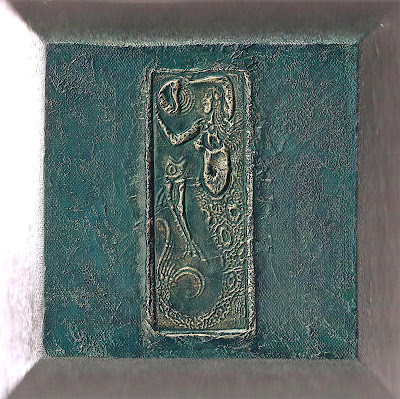

I added some gold oil pastel to the high points of the texture, then added 2 more layers of paint. The gold didn't show through enough, so I touched the high points with Treasure Gold to highlight them. It was difficult to get a good image of this canvas. The image above was scanned and shows the detail well, the image below is a photograph which shows the colour much more accurately but doesn't show the detail so well!


Anyway, Happy Birthday Fiona!

Monday, 20 April 2009

Fantasy film canvas


Apologies in advance for the picture quality - this stuff isn't easy to get good pictures of! I am hosting a fantasy film swap on CC Swaps. We each made an 'item of choice' for our partner. I decided to try making a fantasy film canvas, and this is the result:


I fused several layers of the palest colour of fantasy film onmto the canvas, wrapping it arouind the edges and back, and using an iron to shrink and fuse. I took 2 more layers of the same colour and inked up a large stamp (Stamp Camp) with Stazon, then laid the fantasy film on top, covered with some paper (just to protect the iron) and fused the layers together on the sytamp. I peeled the image off the stamp, trimmed it, and decided the body of the angel needed t stand out a little more. I painted a layer of gold paint on the back, then fused it onto the canvas with the iron.

I hope my swap partner likes it!

Saturday, 18 April 2009

Angelina ATC


I am making some ATCs without paper for a swap on CC Swaps. I decided to use a range of fantasy film and angelina fibre colours. I inked up a leaf and a flower stamp with black Stazon, then laid 2 layers of fantasy film/fusible film/angelina film on top, a layer of silicone paper on top of that, and ironed for a few seconds on the silk setting of my dry iron to use the layers together and heat set the image onto the film. I cut around the images and found myself the pleased owner of some very shimmery flowers and leaves.


I cut some fantasy film out, and layered 2 pieces with a thin layer of angelina fibres between them. I laid the silicone paper back on top, and ironed it all together to fuse it into one sheet. I ran the sheet through my Wizard, using the ATC die cutter. Finally, I laid my leaves and flowers onto the ATC shapes, put the silicone paper back on top, and gave another few seconds with the iron to fuse the leaves and flowers onto the ATC background.


I like the way the angelina fibres give texture to the background, while the different colours of fantasy film stand out from each other.

Friday, 10 April 2009

Fantasy canvas


Jean's theme for this Girl of the Month gift was 'fantasy'. I did think about making something using fantasy film, but decided to paint a canvas instead! This was one big learning curve of experimentation for me - and the reason it fits the fantasy theme is that I have fantasized about painting a textured rich canvas that I like!


The canvas is about 7 inches by 9.5 inches. I layered torn book pages onto the canvas, then a wash of watered down gesso, and a quick coat of Opals Dust (this gives deep down sparkle at some angles). I then added many coats of fluid acrylics and gel mediums.

I added texture to the background by stamping a texture stamp into one layer of half dry gel medium, and then added the focal points by stamping into gel medium and highlighting it with Treasure Gold (yes, I think I do use this stuff on everything I make!). The colour reminds me of the deep ocean, and the canvas has a deep rich polish. I'm really pleased with this and may make something like it for my own wall!!!

Wednesday, 1 April 2009

Friendly plastic art

I am taking part in a swap where I had to make something incorporating Friendly Plastic, and this is what my partner will be getting:


I used a Krafty Lady mould and lots of small pieces of Friendly Plastic left over from other projects. I put them all in the mould, heated with a heat gun, dipped my fingers in cold water and pushed the plastic into all the nooks and crannies in the mould. I didn't fill the mould - the piece is about 1/8th of an inch thick all over. Once it had cooled, I pushed it out of the mould and gave it a thorough rubbing with Treasure Gold, then set about making the background to set it off.

I took a 5 inch by 7 inch canvas, and covered it with scraps of paper form an old Welsh language book. I gave this a thin coat of Titan Buff fluid acrylic, then several very thin coats each of 3 or 4 colours of fluid acrylic - paynes grey, transparent orange and yellow and a crimson.

I took a fleur-de-lys stencil and a gold oil pastel crayon, and stencilled half motifs down each side before giving the canvas a final coat of the crimson paint. The canvas probably has about 20 coats of paint on it, and this gives a lovely rich polished sheen. I stuck the Friendly Plastic body on using extra heavy gel medium.

House chunky book

I decided I liked the covers enough not to do any more to them, so I just named my house the 'House of Fun' - because fun is what I get from making and receiving art. I punched four holes in each page and tied them to each other using a fancy white yarn, to make a concertina style book.


Here are half of the fronts of the pages:


and here are the rest:


Here are half the backs:


and here are the rest:

The book looks lovely on my art shelf. You can see the post about my own page for this book here.

Monday, 30 March 2009

Gesso and Quink


I bought a very inspiring book earlier this year - Textile Translations by Maggie Grey - and have been drooling over it ever since. Maggie also did some supplementary online lessons for those people who have bought the book, making the cover price very good value indeed.

I have worked mostly with paper, card and objects over the last few years, and seem to have a mental block about fabric. I don't know why, I have made many pairs of curtains through my life, and lots of my own and my children's clothes. But textile art is another matter... When I got the book, I didn't have the supplies needed, and now I have the supplies I also have the mental block!

Anyway, to get over my block, I thought I'd try one of the techniques on mount board, instead of craft vilene. I was in a chunky book swap last August, where we all made house shaped pages, and I needed to make some covers for the book.

I glued a selection of torn and crumpled papers onto the mountboard, brushed and stamped with gesso, added a moulded focal piece made form air dry clay in an Enchanted Gallery mould, and sprayed with Quink black ink, and blue-black ink. I also sprayed with a gold color wash spray from Outside the Margins, this doesn't add colour, just very fine gold glimmer. I added another layer of Quink, and finished with a quick light rub of Treasure Gold. Here are the outsides of the book covers:


And here are the insides, the one on the left sprayed with blue-black ink, the one on the right sprayed with black ink:

I need to add some elements to the covers, and bind them to the pages - I may post another picture once the book is bound.

Tuesday, 24 March 2009

Citrasolv


Citrasolv, an orange oil based cleaner, dissolves the ink in National Geographic magazines to great effect:

http://adriennegoodenough.blogspot.com/search/label/Citrasolv

and there are at least 3 UK suppliers of the product:

http://www.greenhealthwatch.com/goodslifeworks/goodspollutionbusters/pblaun21ccit.htm

http://www.21stcenturyhealth.co.uk/productdetail.asp?category=&prodid=30

http://www.ecohip.org/product.php/659/citra-solv-concentrated-multi-purpose-cleaner-32oz

Why not find some old National Geographic magazines and have a play?


Monday, 23 March 2009

And now for something completely different

This piece is a gift for somebody who set their theme as 'botanical'. I have tried to use muted natural colours, to bring a feeling of a botanical illustration book page to the piece.


I gathered the flowers and leaves from my garden, and used the microwave to 'press' them, or dry them. I used a sandwich of ceramic tile, kitchen paper, plant matter, kitchen paper and another ceramic tile, and 'cooked' it on full power for 2 minutes, then 15 second bursts until the plants were dry.

The background is made from pages from an old Welsh language book, with the flowers and leaves adhered using gel medium, and white gesso painted over the whole thing. The stone carved image is an image transfer, with the 'missing sections' drawn in pencil. I finished the piece with a quote by Keats - 'the poetry of the earth is never dead', and mounted it onto some green mount board which had been stamped with Versamark ink.

Sunday, 22 March 2009

Queen of the extreme

I made a gift for a friend who set the theme as 'queenly'. So, here is the 'queen of the extreme' paper quilt, which will be whizzing round the world as soon as I can work out how to package it safely (thinking it might be packed with foamboard as a lightweight stiffener).

The paper was torn and sprayed with several purple colorwash sprays, and I added gold embossing powder down the torn edges. Some paper was cut into fancy shapes and run through the Wizard in cuttlebug folders, and applied some Treasure Gold to highlight the pattern, and some self adhesive gems before adding these pieces to the very top and bottom of the quilt.


I ironed some fantasy film onto dark cardstock, then cut that into squares and ran those through the Wizard in the cuttlebug folder, and highlighted the pattern with Treasure Gold. I mounted those onto larger plain squares with buttons, and added them to the top and bottom, layered over some purple organza ribbon. I added some punched flowers between the squares.

I sprayed some small tags, and added brads and embellishments, then layered those over some chiffon down the right hand side, with punched flowers in between.

The main image is a transfer onto fabric, and the 'frame' is lutradur, with puff paint stamping, sprayed with colorwashes, and foiled on the high points, before small holes being amde with a fine soldering iron. the little crowns are brass charms, the larger crown is german scrap.

Saturday, 21 March 2009

Ironing and recycling

Household chores are getting to be more and more fun! I recycled this soup tin into a pencil holder using fantasy film and my iron.... I used about 3 layers of fantasy film, just dabbed some white glue onto the can to hold the first layer in place while I ironed it, the other layers just bond to the first layer.


The Green Man embellishment is a moulded piece, made from Friendly Plastic in an Enchanted Gallery mould, and rubbed over with Treasure Gold to take some of the glitz off.

Wednesday, 18 March 2009

Doing the ironing


Have you ever ironed a pear??? I have!

I was inspired by Zeborah's fantasy gourd and 'dragon eggs', so decided to try my hand at 3-D fantasy film.

Using a combination of a fake pear, pva glue, fantasy film, an iron and a heat gun, I transformed this life sized fake pear into a shimmery other-worldly fruit! It took a little patience, but I got there in the end.


I did try stamping & embossing the pear, but I foolishly chose an interference embossing powder which didn't show (and I thought it was going to show in a deep iridescent green!!!). All this process did was take a lot of the shine away, and I didn't like the pear quite as much. So I ironed on some angelina fibres:


It's still not quite as pretty as it was with just the fantasy film, and you can't really see the texture or colours very well in the photograph, but I rather like it!!

Monday, 16 March 2009

Friendly Plastic suppliers

I've been asked where on earth people can buy Friendly Plastic!

If you live in the US or Canada, I am led to believe Sunshine Crafts is a reliable supplier, and very reasonable in terms of price ($1.49 per stick). They also sell some books and tools.

If you live in the UK, I know Liz Welch at Rare Bird is a world expert who uses Friendly Plastic in some unique ways, and who sells Friendly Plastic and all the tools, DVDs and more that you might need to use with it. Liz also ships internationally, so if you live elsewhere you can still buy your supplies from this webstore.

Sunday, 15 March 2009

Hidden Friendly Plastic

I am making a metallic item for Annie. I knew I wanted to have some letters under the metal, to make the words appear in relief, but didn't have any letters to use. I decided to make them myself using Friendly Plastic! I heated the FP on the craft mat with the heat gun, and stamped into the pieces firmly with a texture stamp. Once cooled, I peeled the stamp off, and re-heated the FP. When it was shiny and soft, but hadn't lost it's texture, I used some small letter cutters that I found in Tesco last year. I pushed the cutters in hard, and left them there until the FP was cold.


So, lots of letters! It doesn't matter that they are different colours, nobody will see that. Sorry my pictures are blurry - the macro button on my new camera doesnt work as well as I expect it to!

I cut a piece of thick cardboard, then covered it with several layers of metal tape (from the DIY store, intended for pipe & roof repairs). I added the letters, and more tape over the top. I used a range of tools (Ten Seconds Studio) to make patterns in the metal, and ensure it was well burnished. I coated it with Paynes Grey fluid acrylic paint, and then rubbed mosyt of it off. This takes the 'shiny new' look away.


I added several colours and coats of Treasure Gold, as I know Annie likes blues and greens. I buffed with a soft cloth between colours and coats.

I added green amber Treasure Gold to the tops of the letters, to highlight them.

Added some cord to hang it, and it is done! Hope Annie likes it.


More friendly plastic

Hmmmmn. I am starting to like this stuff. I have been playing a little with ways to use it other than in moulds. Here are some early examples.

1. Friendly Plastic heated with a heat gun (on a craft sheet) until shiny and soft. Lay some punchinella on top, push from behind the craft sheet (use a cloth to protect your fingers) to extrude Friendly Plastic through the punchinella. Picture shows small hole, medium hole and starry hole punchinella.


2. Friendly Plastic, heated with a heat gun on a craft sheet and stamped into - I used a texture stamp, inked up with versamark, and held it down - pressing quite hard - until the FP had cooled some. Leave till completely cold and peel off stamp. In the 2 samples below, I have added Treasure Gold to the left hand half of each sample to bring out the pattern.


3. Stamping into the Friendly Plastic like this leaves you with very thin FP - about 1-2 millimetres or 1/16th of an inch or thereabouts. So I thought it might die cut - I ran some pieces through my Wizard with Cuttlebug dies, and it worked reasonably well. If I stamp harder to make the pieces thinner, and use a sheet of paper or very thin card as an extra shim, I think it will work even better (I had to cut these with scissors in places to get the die cut pieces out).


4. Getting more ambitious. I cut some thin strips of Friendly Plastic and laid them all next to each other on the craft mat, then heated until they all went shiny and soft and stuck to each other. While it was all still hot, I pushed a circle cutter into the Friendly Plastic, then left it to cool. Once cool, I took the cutter and circle out. I took two other colours of Friendly Plastic, heated them, and used the cutter again. Once cool, I had 3 circles and 3 'backgrounds'. I wish I'd taken a pic at this point because they were very pretty. Anyway, I put the circles in the other colours of FP, then re-heated to join them together. And then I spoilt them by stamping into them! They were definitely prettier before I did that. However, this is what I ended up with, I think they can be reheated and used in moulds, or maybe I can cut shapes from them to make pendants.

No doubt I'll play some more today, and share the results later! The only thing I don't like is the waiting for it to cool bit - for some things you can drop it into cold water and cool/set it instantly, but not when it's on a large craft mat. Maybe I'll cut my craft mat into small pieces, so I can just drop each small piece into water as I work. It would certainly speed things up!

Saturday, 14 March 2009

Working with colour

Do you ever struggle with colour? Which colours go with which, or which tones to use? Do you know the difference between a warm blue and a cold blue? Or pink? Or a hue and ? Or what a value is?

My friend Beverly Gilbert, in addition to being a wonderful teacher and beader, has a fantastic eye for colour, and has started sharing her expertise on her blog. She has some simple exercises to help people think about colour, and work through colour combinations.

It's well worth a look!

http://beverlygilbert.blogspot.com/

Enjoy - I always do! And looking at all those colour combinations inspires me to go off and make art!

Friendly plastic play

I've been playing with Friendly Plastic in readiness for a swap. I like using FP with silicone moulds as the resulting embellishments are very lightweight and survive the worlds postal systems incredibly well (unlike heavy embossing powder embellishments, which are often shattered by the experience!). You can also make the FP very thin, and sometimes 'partial' moulds are more interesting than complete ones.

I have a bowl of cold water by my side, lay the Friendly Plastic into my mould (foil side down) and heat it with my heat gun until it gets shiny and slumps into the mould. I dip my fingers into the cold water, then use them to push the FP into the mould, making sure it's pushed into all the nooks and crannies. Fingers don't burn if there is water between them and the Friendly Plastic, but they do burn if there isn't - so be careful!

When I have finished pushing the FP into the corners, I drop the mould and FP into the cold water and leave it there for as long as I can bear to. If it has any flat shiny bits when I unmould it, it means that particular bit of FP didn't get hot enough to melt into the mould properly, so I just repeat the process, focussing on that area of the piece.

I find the Friendly Plastic colours a little bright, so always tone down or add other colour by rubbing gently with Treasure Gold wax. Here are a selection of pieces, some made using scraps, some using just one piece of FP. Remember that you can enlarge the picture by clicking on it.


As you can see from the mermaid, you can use more than one colour in the mould - she was made using scraps of turquoise and gold. The green man at the front of the picture was made using lots of small scraps of various colours, the Treasure gold brings them all together into one piece.

I use Krafty Lady moulds, Enchanted Gallery moulds, and some I've made myself using 2 part silicone mould compound, which you can buy very reasonably at Polymer Clay Expess. I am looking at experimenting with different methods of working with Friendly Plastic, and trying to create some lovely things without ending up with a sticky grey mess (which is what many of my efforts were like before I discovered using it in moulds!).

Wednesday, 11 March 2009

Metal tape ATCs

I made these metal tape ATCs for a swap. I scanned them and took a photograph and neither came out very clearly! The backgrounds were several layers of metal tape, applied to cardstock, then the whole was run through the Wizard in a cuttlebug folder. I ran round the edges with a herringbone Ten Seconds Studio roller tool.


They looked rather too bright and silvery, and rather than use alcohol inks to colour them as I have in the past, I had a 'grunge' moment and decided to use patina solutions. I painted 2 of the bases with blackened bronze base solution and the other with blonde bronze. While they were still damp, I added the top coat of green patina solution, and... not much happened!

I did get an aged metal look, but nothing remotely like bronze, which is what I'd been hoping for. In the past, I've had lovely distressed metal effects, but in the past I have been applying the solutions to cardstock. I don't know whether my solutions have gotten too old and are not working, or whether they just don't like the metal tape!


Anyway, I sanded over the backgrounds to bring the raised areas out in shiny metal, then added the embellishments. The embellishments are made by heating fun foam until it begins to curl and is slightly shiny, and stamping into it. Hold the stamp down firmly until the foam has cooled, and cut round the image. I coloured these pieces with Treasure Gold waxes in pewter (the outside ATCs) and with a combination of Onyxite and Indigo (the cente ATC), and added keys, hearts and Dymo lettering.

Saturday, 7 March 2009

No paper no card ATCs

A challenging swap - make a set of 3 ATCs without using paper or card. I did consider fabric, but working with fabric never goes smoothly for me (not even if I iron it!!!), so I went for plastic. The bases of these ATCs are thin translucent frosted plastic.


I daubed some micaceous iron oxide onto the plastic, then put 2 ATCs together, squidged the paint around and pulled them apart, to create a textured, organic look. I painted the backs with gesso so that you could see the textured iron oxide more clearly, then coated the front with some transparent fluid acrylic paint.

I added small gold mica flakes in a random stripe down one side, and a couple of spots on the other side. The images are made by inking up stamps with Stazon ink, laying 2 layers of fantasy film on top, covering with baking paper (to protect the iron) and ironing for a moment or two on a medium to high heat. Trim, and adhere. The 'frames' are cream dimensional paint, highlighted with Treasure Gold once dry.

Sunday, 1 March 2009

Flight ATC

I had another play with the Ranger Distress inks. A friend said she'd been taught to dab the cardstock onto the ink on the craft sheet, rather than squish or twist - which is what I did before.

I used milled lavender, mustard and shabby shutters this time, spritzed with water then dabbed and patted the card onto the spritzed ink on the craft sheet. I didn't spritz the cardstock, and I gave the card a blast with the heat gun between colours. The effect is quite different - the colours don't flow together, they lay on top of each other, and give the whole piece a mottled effect which I quite like! I stamped and embossed the image with Moonglow Obsidian Bronze embossing powder, and mounted onto some black/gold pearlescent card.

Saturday, 28 February 2009

Needle felting

My needle felting supplies came yesterday. I'd had a long couple of days was too tired to concentrate enough to craft, so was slobbing out in front of coronation street and had a little play with it.

I bought my colour co-ordinated 'kit' from Crafty Notions,

http://www.craftynotions.com/npk.htm

and this is what came in the plastic box:

A fairly dense sponge block - about 4 x 6 x 1.5 inches.
Felt and muslin
several shimmery nylon fibres
2 different colours of wool
a length of wrapped wool fancy fibre
some silk or imitation silk fibres
a bit of organza ribbon
5 felting needles
1 tool

I laid my 'backing material' (felt for my first go, the instructions say you can use the muslin the end effect would be different.)

I laid fibres of various kinds randomly across the felt and started stabbing with 4 needles in the tool. I also tried using one needle without the tools, as the instructions suggested, and discovered that I liked that much better! It gave me more control over what I was doing and my 'inner control freak' was much happier about that!


There is a lot of repetitive stabbing, but the fibres felt together quite quickly and you have a great deal of control over which elements
and colours go where (unlike traditional 'wet' felting).
I think this is a great way of creating small embellishments - you can make a patch of 4 x 4 inches of felt in half an hour or so, and you could cut or die cut (or maybe even punch?) shapes out of it, to add to other projects. Or you could easily make enough to turn into a little evening bag.

I think the kit is probably OK in terms of value for money, but if I had understood the process and requirements better, I'd just have bought 5 medium felting needles and the foam - because I already have
felt and lots of fibres in my stash!

I did like the fact that this is something you could take with you and do anywhere - doctors waiting room, train, bus etc and the results are
fast enough to satisfy my 'instant gratification' needs.


Masking ATC


I am in a swap where we are required to use 'masking' as part of the process. I had fun with these. I had bought lots of distress inks when they first came out, but they never really inspired me. They seemed a bit dull. I did watch a couple of demonstrations by Time Holtz and realised that the blending, layering and activting the inks with water were important steps , but even armed with that knowledge I never managed to make anything I liked so they have been sitting in a box for some time now!

Annie showed me a new (to me) way of using them - I finally tried it out last night and now I am in love with distress inks!!! I took a craft sheet, dabbed the ink pads onto it (colours next to each other, not on top of each other), spritzed with water, and dabbed my white cardstock onto it. Repeat as often as you need to cover your card. I used Spiced Marmalade and Broken China. I ended up with the most beautiful combination of blues, bluey greens and rusty colours blended into each other. I cut the ATCs from this using the Wizard - so much easiert o get perfect ATC size and shape than knife and ruler, or paper cutter!


I stamped my image with Stazon, then stamped it onto a 'post-it' sticky note, and cut that out. I laid the mask I'd made over my stamped image, and added more Spiced Marmalade to the background around the mask, then lightly spritzed with water to blend the inks. I dried it with my heat gun before stamping a numbers background using Brilliance Coffee Bean, and the words in the window in Ranger's Snowcap pigment ink. I finished the ATC with a few white dots around the edges, using a Ranger Inkessentials white pen.

The interesting swap results

Here are the first sets of the interesting swap ATCs. 4 stampers, the same stamp, and all the freedom in the world. Don't they look different? Mine are always bottom left, Rosie's are top left, Carol's are top right, and Annie's are bottom right.


Notice how Rosie has reversed the image - great idea!

Wednesday, 25 February 2009

An interesting swap

I've been involved in an interesting swap over the last 2 weeks or so. We were divided into groups of 4 players. The idea is that each player made 4 ATCs using their own stamp, then mailed the stamp onto the next player, who made 4 ATCs then mailed the stamp on to the next player, and so on. Once we had worked with all 4 stamps, we mailed a set of the 4 ATCs we had made to the other players. I was in 2 groups, and here are the ATCs I made.

This was made using a Home Impressions stamp provided by Rosie - I used half of the stamp, rotated and stamped 3 times. The background was 4 Radiant Rain interference colours sprayed onto black card stock. I stamped with versamark and embossed with Moonlight Bronze Obsidian embossing powder from Lindy's Stamp Gang, and punched some small flowers from plain black card and glued them on. I mounted the image onto a striped silver metallic background, which I coloured with Brilliance Pearlescent Crimson ink.


This was Mawgan's stamp - made by Paper Artsy - background was made from Amaeretti de Soronno biscuit wrappers glued onto cardstock and coated with gesso, then stamped with Ranger archival ink in sepia. The 'ribbon' down the side is self adhesive paper ribbon, which I coloured with distress ink. The heart was punched form a hand made background paper, embossed in a cuttlebug folder, and highlighted with Teasure Gold. A few tiny copper coloured peel offs finished it off.


The background for this ATC is stamped with Brilliance Coffee Bean ink onto some glossy cardstock coloured with alcohol inks, using a Madjac stamp. Liz's stamp was the inkspot and text stamp, which I stamped onto shrink plastic, texturised while still hot, and attached with a brad. There is a face behind the shrink plastic 'door'.


This was Carol's stamp. I struggle with Victorian images, and had trouble with this stamp, which didn't 'grab' me. Eventually I stamped it onto a Twelve x 12 paper using purple ink and green iridescent embossing powder, then stamped some faint scrolls in the corners with a chalk ink. I added a polymer clay butterfly to finish, and mounted it onto purple pearlescent cardstock.


Annie was mean to me, she knows I love this stamp by Cory Celaya, but find it hard to use. Well, I had to use it this time LOL. I stamped the background by stamping the stamp 3 times in 3 colours, offsetting it each time. I stamped the image onto 'mother of pearl' fantasy film using blue Stazon ink, and cut round the image and used this as the focal point. I made a sheet of 'paper' by fusing angelina fibres together with inclusions of fantasy film, and cut small squares out and added them to the ATC with wire, threading small beads onto the wire to add interest. Finally, I mounted it onto dark purple pearlescent card.


This was an interesting stamp, by Queen's Dresser Drawers, again from Annie. I had some 'wrap around' cardboard ATC holders, so daubed them with several colours of Radiant Rain, then embossed them inside and out with 2 texture stamps and Moonglow Bronze Obsidian embossing powder. I made polymer clay embellishments as 'closures'. These were black clay pushed into home made silicone moulds which had been brushed with PearlEx, and 'cooked' for 15 minutes in the Melt Pot. The ATC inside was stamped onto 'waste' paper which has overspray of Radiant Rain from other projects, and embossed with the same embossing powder. I punched holes down the left hand side and mounted onto deep red cardstock.


This was my own stamp. I stamped it onto a hand made background, layered some of the paper 'ribbon' which I'd coloured to match on top, and mounted it all onto some dark green textured card stock.


This was also my stamp, by Queens Dresser Drawers, stamped onto a background paper made by spraying gold colourwash spray from Outside the Margins onto watercolour paper, then stamping the image and embossing with Moonglow Bronze embossing powder, and adding a black Hearty air dry clay shell moulded piece coloured with Treasure Gold.

I will ask the other players in the swap if I can add their ATCs to this post so that you can see how we each used the same stamps. Watch this space!

Sunday, 22 February 2009

Shrink plastic discovery

I was making some shrink plastic embellishments for an ATC swap, and I wanted them to co-ordinate with the background paper I'd made.

So, I used 3 colours of ink from a Colorbox queue to stamp my image, overlapping and offsetting it as I went along. Then I shrank the plastic, as per usual, and texturised each piece by stamping into it using the same stamp (uninked) before it cooled.

When I touched the pieces, the ink felt a little tacky, which struck me as odd, as I've used Colorbox inks on shrink plastic before and they had always heat set perfectly. When I looked at the packaging I realised the queue was 'classic pigment ink', rather than the chalk ink I thought I'd been using. Perhaps it doesn't work in the same way.

I left the pieces overnight, and when I touched them they still felt tacky, so I decided to seal them. I painted one with Diamond Glaze, and watched, horrified, as the ink dissolved before my eyes. I quickly wiped the diamond glaze off, thinking that I may be able to salvage the shrink plastic for another project if it wasn't shiny. I tried other products on the remaining pieces,and the ink dissolved on all of them. I had no more shrink plastic in my stash, so made alternative embellishments for the ATCs.

Then I decided to look at the shrink plastic pieces I'd made, to see if they could be turned into something useful.

The one on the left is how they all looked after the ink dissolved
(remember to click on the image to enlarge it)


I rubbed Sapphire Treasure Gold over the shrink plastic, and it brought the texture out beautifully (2nd from left).

I rubbed the Treasure Gold off with a baby wipe for a more subtle effect (3rd from left).

The final piece (far right) hadn't texturised very well in the original process, so I decided to try re-heating it and stamping into it.

Nothing seemed to happen, it didn't seem to soften with heat, and although I stamped into it again, I couldn't see any texture. And then I added the Treasure Gold, and realised the second stamping had given a rough sandpapery effect where the stamp touched the plastic. Cool....

I will play with this again, on purpose, next time!!!

Saturday, 7 February 2009

A gift for Sweetpea

It's Sweetpea's turn to get gifts from all the Art Venturers, and she wanted something 'funky, with bright colours and black & white checkerboards'. This is not my usual style or colour palette, and I'm not sure my colours are quite as bright as I intended, but this was my fifth attempt at a gift, and the only one I've managed to get finished - I binned the previous attempts half way through!


I took some mount board, and painted it with gesso. I stamped a harlequin design into it whilst the gesso was wet - the gesso doesn't need to be thick, even thin gesso will show an impression form the stamp. I washed the stamp quickly, and let the gesso dry. I added colour by applying blue, green, red and orange acrylic paints thinly, using a baby wipe. I added a second coat of some colours. A kind friend sent me a zettiology stamp recently, and I decided this was the perfect project for it, so I stamped it onto white watercolour paper, using Stazon permanent ink, and carefully cut it out. I glued it onto the background, then glued black & white chequered tissue paper to the edges of the piece. I gave the whole panel a couple of layers of glossy glaze, then added the four flower embellishments. I added a hanger to finish it off. I hope Sweetpea likes it.

Friday, 6 February 2009

Gesso on photographs ATCs


These 3 ATCs began life as photographs in a gardening magazine. I painted them with a thin layer of white gesso, then used a Versamark pen to draw dots and lines on the images. Finally, I sprinkled gold embossing powder and heated. Thye remind me of Cloisonne work, but in chalky pastels!

Guestbook

Copyright

Please note that I assert myself as the creator of all art on this site (unless I credit another artist) and retain copyright of all artwork posted on this site