It's been 6 months since I updated this blog.
That's partly because of not having much time to make art in the last 6 months, but also having trouble posting because of arguments with my new computer, running Windows 8, about my having 2 google accounts. It doesn't like my split personality, so I am abandoning this blog and moving here.
I hope you'll come with me.

Sunday, 29 June 2014

Friday, 10 January 2014
MIxed media with maps ATCs
The theme for December's monthly ATC swap was 'Mixed media using maps'.
I had a plan. It depended on a stamp. I couldn't find the stamp.
This is 'plan B', using maps in a much m ore subtle way, which I rather like!

I started with a background made by gluing newsprint to cardstock, then using an old credit card to apply paint in reds, blues and purples. Using the credit card to spread the paint means it goes on very quickly, in a very thin layer, and dries fast. My background was too bright for me to use, so I added a layer of white gesso, again using the credit card. This gave a much more subtle effect.

The background looked a bit old and dusty, so I thought I'd go with the flow and add some cracked areas. I used a mask to keep the cracks off the area I planned to add my main image to. I used distress ink, which looked lovely, but which didn't dry properly on the gesso, despite using the heat gun, so I sprinkled with clear embossing powder and heated to 'fix' it.

Next came the main image, which I stamped with versamark, and embossed with 'blue raspberry' two tone embossing powder, for dramatic effect.

She didn't have quite enough dramatic effect, so I decided to make her stand out from the background a little more. I drew around her with an inktense pencil in what looked like a dull dark blue. I added water,a and it turned out to be a much brighter blue than I expected! I should have tested on a scrap of paper before I used it on the ATC! Still, it makes her 'pop'.

You may have noticed that there's not much evidence of maps so far. I had decided to use the map for embellishments. I took a vintage map, dampened it with water, and coloured it with faded jeans and picked raspberry distress inks.

I cut small strips of map to use as 'ribbons' across the bottom f the ATCs, then added a few french knots with hand dyed thread. Next, I used a paper punch to cut out lots of flowers. I assembled these, and used a small white brad to hold them together and attach to the ATC.

Friday, 3 January 2014
Glittery book
I made this book for a swap with the theme of 'glitter'. I wanted to use glitter in a subtle way, rather than in an 'in-your-face' way.
I created the book by tearing 5 sheets of watercolour paper for the inside, and a slightly larger sheet for the cover. I painted the cover with a mixture of matte medium, turquoise, jenkins green and titan buff fluid acrylic paints and dabbed a crumpled piece of paper on it to add texture.
Once the paint was dry, I used a Basic Grey laser cut 'doily' as a stencil, and dabbed on Stewart Gill Metamica paints in 'brass' and 'verdigris'. Once dry, I added glitter by dabbing on 3 colours of Stickles, and spreading it around with my finger. It doesn't show that well on this photo, but you can see more of it on the second photo.

To finish the book off, I did a very simple binding using some tubular variegated embroidery thread, and a polymer clay. The pear was made by rolling Premo Accents clay until thin, creating texture using a rubber stamp, and baking until cured. This is the first time I've used Premo Accents and I was very disappointed because the gold isn't shiny, it's very matte. And I needed shiny. Very shiny. So, after a generous application of Treasure Gold, my pear is beautifully shiny!

Tuesday, 31 December 2013
Lutradur wall hanging
I had to make something for a swap, using Lutradur.
I started by taking white lutradur, and adding a very thin layer of gesso through a stencil I then used crimson and orange fluid acrylics to colour the lutradur, the gesso takes the paint differently to the lutradur and creates a nice effect. I painted another piece of lutradur crimson, and mounted the gessoed piece onto it using gold brads.

For the focal piece, I took some dark grey lutradur, added gesso, then painted it deep brown using fluid acrylics. I glued on a moulded polymer clay embellishment, and used more gold brads to attach to the layers below. The whole piece needed some sturdy support, and some contrasting colour to make it 'pop', so I cut a piece of mount board and covered it with some bright green polyester 'fabric' from the florists. I adhered the lutradur piece to this base with matter medium, and added a little ribbon hanging loop.
Monday, 30 December 2013
Maple leaves book page
More maple leaves. This is my page in a collaborative hanging book, where each player was given a colour of the rainbow. We had an extra player, so we needed an extra colour, I added crimson to the rainbow :-)
As I'd drawn a maple leaf shape to use to draw around for my textured acrylic panel, I thought I'd use it again. I layered up some autumnal colours of organza with snippets of organza between the layers, then used my special Margaret Beal soldering iron to trace around the maple leaves. As I had spare layered organza left, I created more shapes to finish the bottom of the page off.
I painted a piece of canvas with quinacridone crimson fluid acrylic paint, then I sewed the maple leaves on using variegated threads. I finished the piece by adding dots of iridescent gold fluid acrylic, using the end of a a bamboo skewer.

I have everybody else's pages now, they were all gorgeous - I really must get around to binding them into the hanging book, and put them all on display.
Sunday, 29 December 2013
Textured acrylic canvas panel
This was an experiment, following the instructions given by Lisa Kesler, in an article called ' Texture and layers with acrylic paint and stencils', published in Cloth Paper Scissors.
The first step was to cover your substrate (I used a canvas panel) with masking tape.

Next step was to come up with a design which was a combination of a main focal image, and background shapes or images. I drew my background shapes onto the masking tape. As I'd be cutting around the shapes, I didn't choose anything complicated!

Next, I cut around my shapes using a sharp craft knife, then peeled off the masking tape from around them.

I added a layer of moulding paste, and textured it using bottle tops and pieces of netting.

Once dry, I peeled off my masking tape shapes, and painted the whole piece with watered down fluid acrylics in two or three colours, letting the colours pool in places.

Once dry, I added a warm ochre colour all over to bring it together.

Then I added green, using a baby wipe, so it didn't go into my shapes. It's not looking brilliant at this point, but I know my next layers will really help.

More layers, getting darker and warmer.

The final layer, quite a bright orange, I s added all over, including in my shapes. I'm quite liking it now. The colours in this photo are a bit brighter than real life.
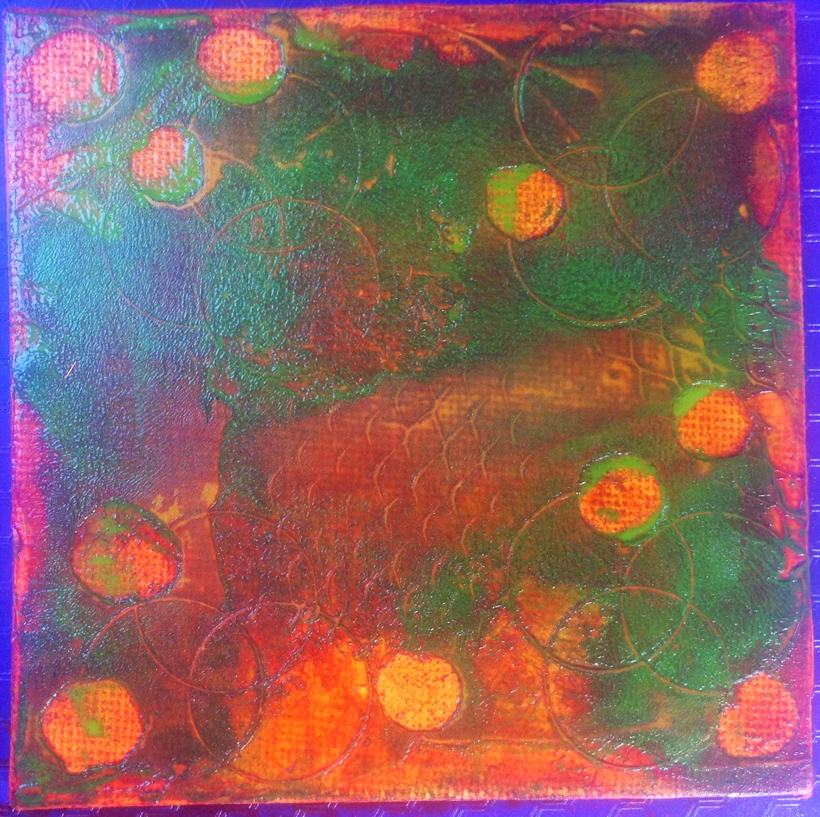
For the next stage, we're back to the masking tape. Once you've covered your canvas with masking tape again, you draw your main image on the tape.

Using a craft knife, cut around your image again, but this time lift the image rather than the tape around it.

Add more moulding paste, and remove masking tape.

Once the moulding paste is dry, add more paint layers.

Paint your main image carefully, making sure you don't get any on your background.

I added several layers of crimson, then used an iridescent gold oil pastel to draw the veins on the leaf, before adding a final layer of paint. The finished piece.... which took all day on and off, 10 minutes here and there with lots of drying time in between layers.

Eagle eyed readers will have spotted that my background circles aren't all in the same place. I made several of these at the same time, and didn't always photograph the same one!
Lutradur book
I made a little book out of Lutradur, gesso, woven brass 'fabric', and beads.
.JPG)
I used 2 pieces of Lutradur about 6 inches by 4 for the cover. I coloured them with fluid acrylic paints. Once dry, I used foam stamps and gesso to add images. If you look carefully, you can see gold shiny areas, I gently stroked on some treasure gold for texture and to break up the larger areas of colour a little.
I cut strips of woven brass 'fabric', punched small holes in them, and sewed them onto the front cover with french knots. I decided that I didn't want a closure to spoil the front cover so added a button to the back cover, and made a beaded loop to close over the button. I also added beads to the pamphlet binding.
.JPG)

.JPG)
The inside of the book is also made of Lutradur, coloured and decorated in the same way but using slightly brighter colours. I folded it to a pattern, the pockets are just the right size to tuck ATCs into.
.JPG)
Saturday, 17 August 2013
Been remiss
I have been remiss, I haven't blogged in months. I have been knitting, embroidering, making mixed media pieces and papercrafting, but haven't gotten around to downloading my pictures off my iPad or camera :-(

Here are the 3 jewel sisters, who live on painted canvas backgrounds. I hope you like them!
Saturday, 1 June 2013
Small paper pournal
This was another project from my few arty days in Shropshire, this class was taught by Wendy and Annie.
We made a small blank journal, about 5 inches wide by 6 inches tall.
We used Brusho washes to colour paper (lining wallpaper), then once it was dry, we sprayed Brusho washes with added mica through stencils to decorate the pages.


For the covers, which were inspired by a Linda Monk class Wendy had taken, we used scrim painted with gesso and paint, to create texture. I coloured the scrim with fluid acrylic paint and added glitz with Treasure Gold, before sewing some beads on and adding a butterfly.
The butterfly is made from polymer clay, stamped into and cut out using a cutter, then painted with acrylic paint after baking.

Shrink plastic ATC
One of my regular monthly swap ATCs - April's theme was 'shrink plastic'.
The background was interesting - it's a Gelli print.I brayered Jacquard Lumiere paint onto the Gelli plate, and it behaved in interesting ways - it beaded up. So I took a print using some paper which had I'd already printed with light coloured paint. I love the effect, and added to it by stamping with turquoise Stazon.
I added a little washi tape around the bottom of the ATC then set about making my shrink plastic embellishments. I coloured translucent shrink plastic by very lightly touching it with inkpads in pale colours, then stamped it with my favourite butterfly stamp (which is too big for most things). Once shrunk, I edged the butterfly with turquoise Stazon, and added a 'body' using some gold 3d paint.
Finished with a silk flower held on by a brad and mounted on a turquoise background, and it's done!

Inchie postcard
I quite like making inchies, but never know what to do with them. I have a bag full of paper and textile inchies from swaps and must think up a way of displaying these tiny pieces of art.
So, I set up a swap where the inchies were made and mounted onto a postcard so that they were already displayed. This is my inchie postcard - a mixture of card and metal inchies.
Most of my card inchies have Gelli printed backgounds, and have been rubber stamped then embellished with sequins and brads. The metal inchies were mmade by sticking metal tape onto cardstock, adding texture with an embossing folder, then colouring using Vintaj patina paints, and sanding off unwanted paint.

I liked it enough not to really want to let it go, but sent it anyway!
Textured pot
In April, I went to Shropshire for a few days with a group of friends. We'd each agreed to give a half day class, and here is the textured pot that Liz Welch taught us to make.
We made little faces from cloud clay, each face is about an inch tall. I coloured my clay blue, using mica powders, and added more colour with a little acrylic paint when I'd finished them.
These were fun to make, each has his own little character!

Next, we set about decorating a cardboard pot - this one had contained sanitary products but apparently they are no longer packaged this way, which is a shame as the container was sturdy and a useful size! Liz had kindly paint the pots for us before the class, but this is easy to do, a coat of gesso then acrylic paint in a strong colour or two, then dry brushed with metallic paint.
We took some scrim and dipped it into a mixture of ink and Paverpol fabric stiffener until it was really well coloured and very sticky! Next, we draped and otherwise artfully arranged the scrim onto our pots, sticking it to itself and the pot, and trying to leave some suitable gaps to put faces into. Once the scrim was dry, we rubbed Treasure Gold gilding wax onto the high points. I rather like the look of it just as it is!

The next step was to stick our little faces onto our pots. I thought my faces stood out too much, the colour didn't blend in well enough for me. I added some more Treasure Gold to see if that would help, but it didn't.


So I left the pot to sit for a week or two. Finally, I decided to paint the faces with some fluid acrylic paint - a mixture of turquoise and green, as close to the colour tones of the background as I could manage.
Suddenly my faces look as if they belong on the pot!
I added some Treasure Gold to finish them off.
(a bit too much, it is easy to be heavy handed with this stuff)


Now I really like my little faces pot, and it is in my studio holding pens, pencils and other tools!
Colourful tags
Oh, a whole month and a half has slipped past since my last post. I was away for a couple of weeks and then I've been unwell enough not to feel like posting. So today I will post a few things to make up for it!
I'm taking part in an monthly 'colourful tags' swap, the colour scheme is set for each month but otherwise the swap is pretty open. For my
'green with a touch of blue' tags I layered fluid acrylic paint until it started to look leathery, then collaged on some painted and stamped paper across the centre of the tag.
I used the Gelli plate to print on both sides of the tag, then stamped the top half of one side using Stazon and on of my favourite Stampers Anonymous stamps.
I stamped the bird and egg images (Invoke Arts) onto green paper, and mounted the images in painted slide mounts. The touch of blue was dots of Jacquard Lumiere paint.

For the 'white with a touch of gold' tags, I used moulding paste and a lettering stencil to give texture to the top of one side of the tag,and some stencil waste and moulding paste to add texture to the bottom. I then sewed some scrim around the tag using long straight stitches and french knots, and painted everything with gesso, then white acrylic paint. I stamped a series of circles across the back (Stewart Gill), and added some lace trim stickers. Finally I used a W stencil with gel medium to add the W, and when it was dry I painted it gold. To finish the tag, I gently rubbed all the scrim and embroidery stitches with Treasure Gold.

Monday, 15 April 2013
Altered wooden heart
For a recent swap, I was sent a wooden heart to alter. I painted it black, and stamped some texture pattern in gold Brilliance. I then gave one side a quick coat of PVA glue, and laid some Fantasy Film onto it. I heated it with a heat gun until the colours changed, and holes started to appear.
I did the same thing to the other side, making more holes, and then cut strips of Fantasy Film for the sides.
Once the heart was all shiny and bright, I decided it was too bright, and added impasto paste to dull it down. I stamped into the paste, and also applied some through stencil waste. Once dry, I rubbed Treasure Gold all over the impasto. Finally, I put black polymer clay into a face mould, then brushed it with PearlEx powder, and cooked it in my melt pot for about 25 minutes. I stuck it on with heavy gel medium.


Monday, 1 April 2013
Shrink plastic necklace
Shrink plastic. Amazing stuff.
I decided to make a shrink plastic charm necklace, using clear and translucent shrink plastic.
I drew a heart template shape, then laid it onto the shrink plastic and drew around it to create the hearts. I punched holes in all the hearts, ready for the jump rings.

I coloured the clear hearts with Stazon ink, and heated them. While they were still hot, I stamped into them using a 'crackle' stamp inked up with gold Brilliance ink.

I coloured the backs of the translucent hearts with Stazon, then stamped the fronts with a selection of finely patterned stamps. After heating, I stamped the backs with the gold Brilliance ink and the crackle stamp
I used jump rings to attach all the hearts to the chain,
and added some beads and a little metal heart to finish it off.

The colour in the image above is close to true, but the detail shows better in the image below.

I hope my swap partner likes it!
Subscribe to:
Posts (Atom)