I will send a handmade gift to the first 3 people who leave a comment on my blog requesting to join this Pay It Forward exchange. I don’t know what that gift will be yet and you may not receive it tomorrow, or next week, but you will receive it within 365 days, that is my promise! The only thing you have to do in return is pay it forward by making the same promise on your blog. So basically, if you comment and you’re on, I’ll send you something crafty that I’ll make!
Once you sign up, copy and paste the above paragraph on your blog, and three other lucky people will be recipients of your handmade work. I'm getting paid forward by Carol Sweeney and thought it would be fun to pay it forward to you. I will check my blog daily to see who the first three sign ups are, and if they've joined this Pay It Forward exchange, they will be the recipients from me. Make sure to leave your blog address with your message, so I can check your blog.
Thursday, 29 November 2007
Sunday, 25 November 2007
Stampers Anonymous ATC
The deadline was looming for a swap using a Stampers Anonymous stamp,
and all but a few of my stamps & craft supplies
are hiding behind a mountain of furniture - moved as a
result of remodelling my living room.
and all but a few of my stamps & craft supplies
are hiding behind a mountain of furniture - moved as a
result of remodelling my living room.

Luckily, I had taken this stamp to Art & Soul with me,
along with my Stazon and a few alcohol inks..
I hope my swap partner likes the result!
along with my Stazon and a few alcohol inks..
I hope my swap partner likes the result!
Friday, 23 November 2007
Sunday, 18 November 2007
Italian Gesso background
I needed to create an ATC for a swap,
and as most of my supplies are still inaccessible (house renovations),
I am limited to using the supplies I took to the US.
I have decided that this is a good thing,
as I am having to think differently.
The theme of this swap was 'geographic/place',
so I looked at my supplies (and the rest of the house),
and this is what I came up with:

I took a sheet of cardstock, some liquid acrylic medium,
white gesso, 2 amaretto biscuit wrappers,
some photographs torn from a sheet of printed paper,
a paintbrush, a sheet of kitchen paper towel,
and one drop each of 3 colours of fluid acrylic paint -
paynes grey, transparent yellow iron oxide, transparent red iron oxide.
Tear the biscuit wrappers, mix the gesso and acrylic medium and use
to adhere the papers to the card.
Add small amounts of colour into the mixed gesso & medium,
and use the resulting mess to glue the small pieces
of printed paper onto the background.
Paint mixture over the small pieces of paper,
wipe off with the kitchen paper.
Use some of the left over paint/gesso mix
to randomly daub the sheet between the photographs,
wipe off with kitchen paper.
Allow to dry, use as backgrounds....
Wednesday, 14 November 2007
Knitting!
I don't knit very often. I used to knit jumpers for all the family while I was bringing up children, and had to do fancy patterns because plain knitting didn't hold my interest. I recently saw a beautiful scarf, but thought it was too expensive, and decided to find some similar wool to knit my own.
Well, I failed to find any remotely similar wool, but while I was looking, I saw and fell in love with some hand dyed merino wool.... and ended up buying 2 skeins at £12.50/$25 a skein... plus a pattern book... so my finished scarf will have cost almost twice the 'too expensive' scarf I saw in the first place. And that's without considering the hours it took to knit - around 45, I think!
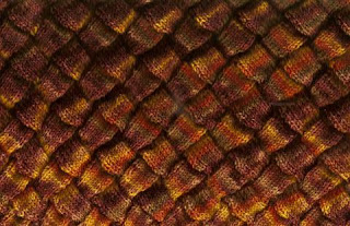
Anyway, here is part of the scarf - and as my friend Maggi said 'you will have a unique piece when you are done'. It's certainly unique, and has drawn all sorts of comments from people who saw it while I was knitting on planes, in airports, at markets, at work... The pattern is called 'entrelac' and you can get very different effects according to the size of needles, and the thickness & fluffiness of wool you choose.
Well, I failed to find any remotely similar wool, but while I was looking, I saw and fell in love with some hand dyed merino wool.... and ended up buying 2 skeins at £12.50/$25 a skein... plus a pattern book... so my finished scarf will have cost almost twice the 'too expensive' scarf I saw in the first place. And that's without considering the hours it took to knit - around 45, I think!

Anyway, here is part of the scarf - and as my friend Maggi said 'you will have a unique piece when you are done'. It's certainly unique, and has drawn all sorts of comments from people who saw it while I was knitting on planes, in airports, at markets, at work... The pattern is called 'entrelac' and you can get very different effects according to the size of needles, and the thickness & fluffiness of wool you choose.
Thursday, 8 November 2007
Sally Jean Alexander's Art & Soul class
Sally's class was the only Art & Soul class I took where the teacher set some 'rules'. We weren't allowed to take photographs during her demonstration, and no 'visitors' were allowed into the classroom, even at lunchtime.
We made a 'divine shrine' by cutting the corner off 4 cardboard boxes and gluing the 4 corners together to give 4 'niches' for artwork. We decorated the niches by mixing acrylic paint with liquid gel medium, and using it as a glue paint, to add colour and also adhere small pieces of printed papers - words form old books, gift wrap, printed papers & images. We used caulk, applied with a toothpick, to adhere objects inside the niches.
Once the artwork was finished, we cut glass to fit the sides, and ground the edges. We copper taped the edges of the glass and the artwork, then painted the copper tape with flux before soldering. My piece had a ground down glass 'stand' which was also copper taped and fluxed so that it could be soldered to the bottom of my shrine.
The shrine took a life of its own as far as the theme went. Sally had told us to bring something precious for our shrines, but I couldn't visualise the finished shrine so only took enough for one 'niche'. I took a watch face and several watch parts. I decorated one side of my shrine, and realised that it represented my father to me (he was a jeweller).
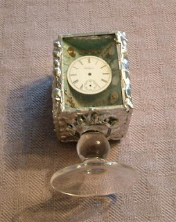
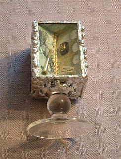
I then looked through my various papers and embellishments, searching for inspiration for the other 3 niches. I found a small broken paintbrush, and some 'Italy themed' stamps I bought at vendor night, and realised that these represented my mother (who paints, and whose ancestry is Italian).
Once I had my father and mother, it seemed obvious that one side of my shrine should be devoted to my husband, and I found a 'gold' (plastic) ring and some 'lucky heather' in my embellishments bag, and some appropriate text in a book....
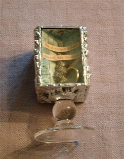
The final side was a problem - until I realised it needed to be about me! I love the country I live in, and had also just learned that I had landed a dream job - developing education at 127 historic sites across Wales, including Caernarfon Castle. So, finding a piece of gift wrap with images of Caernarfon Castle on it was total serendipity! The other elements in this niche are a small shell to represent the coastline that is on 3 sides of Wales, some lichen to represent the clean air, a twig to represent the trees, and some text representing the mountains and warm welcome offered here in Wales...
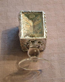
All in all, I enjoyed making my shrine, but feel my soldering needs a lot of improvement!
Wednesday, 7 November 2007
Beryl Taylor's Art & Soul class
Beryl Taylor is a British born artist who now lives in the US.
Beryl originally trained as a fabric artist,
but now incorporates some paper art ideas
and techniques into her work,
and is described as a 'mixed media artist'.
I think her work is stunning:
http://www.beryltaylor.com/
and she has also written a beautiful book:
http://tinyurl.com/yvsukb
The class at Art & Soul was 'making fabric paper'
and involved layering muslin (US)
or fine lawn cotton (UK)
with printed papers and tissue paper
and paint to make a 'fabric paper'.
The technique is described in Beryl's book.
The 'paper' is easy to make but takes a long time to dry.
It took us a good hour of the class
and also the lunch hour
to get our pieces dry enough to work on.
I think it might have been better to
spread the class over 2 evenings -
one making the paper,
the second creating the artwork.
Once we had made out papers,
we glued pieces to felt,
layered them, added stitches & beads,
and finished them off by edging them
with Aileens' tacky glue, coated in Krylon.
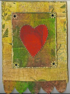 Beryl's sample piece was mounted onto matt board.
I will mount mine and have it framed soon.
Beryl originally trained as a fabric artist,
but now incorporates some paper art ideas
and techniques into her work,
and is described as a 'mixed media artist'.
I think her work is stunning:
http://www.beryltaylor.com/
and she has also written a beautiful book:
http://tinyurl.com/yvsukb
The class at Art & Soul was 'making fabric paper'
and involved layering muslin (US)
or fine lawn cotton (UK)
with printed papers and tissue paper
and paint to make a 'fabric paper'.
The technique is described in Beryl's book.
The 'paper' is easy to make but takes a long time to dry.
It took us a good hour of the class
and also the lunch hour
to get our pieces dry enough to work on.
I think it might have been better to
spread the class over 2 evenings -
one making the paper,
the second creating the artwork.
Once we had made out papers,
we glued pieces to felt,
layered them, added stitches & beads,
and finished them off by edging them
with Aileens' tacky glue, coated in Krylon.
 Beryl's sample piece was mounted onto matt board.
 I will mount mine and have it framed soon.
Tuesday, 6 November 2007
Claudine Hellmuth's Art & Soul class part 3
This is a piece - A4 size - that I created in class, using a 'faux leather' background made by crumpling a magazine page, rubbing with Nevrdull, and then painting with a glaze of Golden fluid acrylics in one or two colours and adding a few touches of metallic pastels. The collaged elements were all altered by rubbing with Nevrdull.
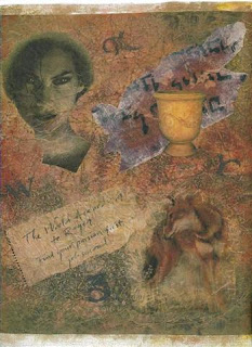
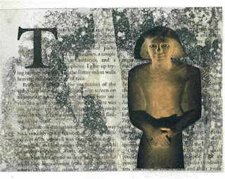
This piece has a background of part of a National Geographic/Citrasolv page (glued onto canvas paper to give it some 'body', with an image cut from a magazine page glued on. It is not finished yet, I am waiting until I see a suitable Egyptian element to add to the page, in the space under the 'T'.
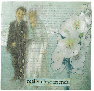
The final sample took only a few minutes to make - it is an area of a National Geographic page glued to canvas paper, with a 'Nevrdulled' flower and some text collaged onto the page. Quick, easy, and looks as if I spent some time on it!!!

This piece has a background of part of a National Geographic/Citrasolv page (glued onto canvas paper to give it some 'body', with an image cut from a magazine page glued on. It is not finished yet, I am waiting until I see a suitable Egyptian element to add to the page, in the space under the 'T'.

The final sample took only a few minutes to make - it is an area of a National Geographic page glued to canvas paper, with a 'Nevrdulled' flower and some text collaged onto the page. Quick, easy, and looks as if I spent some time on it!!!

Claudine Hellmuth's Art & Soul class part 2
The second technique demonstrated in Claudine's class involved concentrated Citrasolv & National Geographic magazines, along with some paper kitchen towel and cling film.
The diluted 'ready to use' Citrasolv doesn't work for this technique, and I doubt if many other magazines would, either.
National Geographic lays down a very thin layer of gold ink underneath its printed photographs, and the Citrasolv and gold ink work their magic together and produce beautiful background papers; many of them look like works by Klimt as the gold ink seems to come to the surface but with many ovals splodges of other colours, as shown here:

Text and image transfers to the opposite page,
too, as you can see below.
too, as you can see below.

It only seems to work if you do lots of pages together. Everything smells wonderfully orangey while you are working and also the papers will smell of oranges for a LONG time afterwards... If you don't like the smell of oranges, this is not the technique for you!
So, grab your concentrated Citrasolv, and use kitchen paper towel to apply it to a NG page - a generous coating, but not enough to puddle. Turn the page and coat the other side. Coat the next page, and the next, and the next, until you have coated the whole magazine with Citrasolv. Insert crumpled cling film (saran wrap) in between some of the pages - especially on double page photo spreads. These pages will have an interesting texture, as in the sample below.
So, grab your concentrated Citrasolv, and use kitchen paper towel to apply it to a NG page - a generous coating, but not enough to puddle. Turn the page and coat the other side. Coat the next page, and the next, and the next, until you have coated the whole magazine with Citrasolv. Insert crumpled cling film (saran wrap) in between some of the pages - especially on double page photo spreads. These pages will have an interesting texture, as in the sample below.

Thursday, 1 November 2007
Claudine Hellmuth's Art & Soul class - part 1
Well, this class was like being back in kindergarten!!! Everybody was that excited about what we were doing, and there were lots of 'ooohs' and 'aaahs'!!! Claudine introduced us to the world of household chemicals combined with magazine pages....
The first technique uses Nevrdull (or a similar product called Duraglit) which is chemical impregnated wadding intended for polishing metal. Neverdull is available in automotive stores in the US, and also in larger branches of Walmart. Duraglit is available in supermarkets in the UK intended for polishing doorknobs and knockers and other household metal objects - it may be in the process of changing it's name to Brasso, but if you buy brasso make sure it's not the liquid.
Basically, the wadding acts as an eraser on colour magazine pages. So, you can remove all the colour and image, or fade an image, or play with an image by removing parts...
Here are a couple of examples of what I did:
 I removed a line of washing strung between the trees,
then removed even more colour, using a stencil, to create a 'ghost'
 I gently rubbed over the whole picture,
then rubbed another couple of times around the edges, to create a 'faded' look
 I folded the whole picture up, then re-folded the other way,
using the same fold lines, to deepen them.
I rubbed all over to take away quite a lot of colour,
and created a 'faux tile' effect.
 If you scrunch the paper up into a tight ball,
then flatten out and scrunch up again,
you create lots of neat fold lines.
Remove some colour and you create a 'leathery' look - in
the sample above I left enough colour for you to see what the image was,
and it gives a 'French Impressionist' feel to the page.
I completely removed the logo
and the 'catchphrase' at the bottom of the advert,
but left the text at the top - is it like some indistinct poem,
adding something to the overall piece.
You may not be able to see that unless you double click on the picture.
The first technique uses Nevrdull (or a similar product called Duraglit) which is chemical impregnated wadding intended for polishing metal. Neverdull is available in automotive stores in the US, and also in larger branches of Walmart. Duraglit is available in supermarkets in the UK intended for polishing doorknobs and knockers and other household metal objects - it may be in the process of changing it's name to Brasso, but if you buy brasso make sure it's not the liquid.
Basically, the wadding acts as an eraser on colour magazine pages. So, you can remove all the colour and image, or fade an image, or play with an image by removing parts...
Here are a couple of examples of what I did:
 I removed a line of washing strung between the trees,
then removed even more colour, using a stencil, to create a 'ghost'
 I gently rubbed over the whole picture,
then rubbed another couple of times around the edges, to create a 'faded' look
 I folded the whole picture up, then re-folded the other way,
using the same fold lines, to deepen them.
I rubbed all over to take away quite a lot of colour,
and created a 'faux tile' effect.
 If you scrunch the paper up into a tight ball,
then flatten out and scrunch up again,
you create lots of neat fold lines.
Remove some colour and you create a 'leathery' look - in
the sample above I left enough colour for you to see what the image was,
and it gives a 'French Impressionist' feel to the page.
I completely removed the logo
and the 'catchphrase' at the bottom of the advert,
but left the text at the top - is it like some indistinct poem,
adding something to the overall piece.
You may not be able to see that unless you double click on the picture.


