
Annie ran a swap last year, where we all made 6 little pieces of art to fit plastic pockets of an odd size - hence 'odd shaped art'. Of course, once in the plastic pocket page, we realised we needed six more to go on the other side of the page...
So, here are my second set of odd shaped art. My new scanner is very clever, and as well as scanning it does this autocrop thing when you scan several things at once. Unfortunately the autocrop feature sometimes crops the bottom off things! So one or two of these have lost their bottoms....
The first is on canvas, two image transfers (one behind the heart), and a collaged photo of a sculpture, plus a friendly plastic broken heart and some Tim Holtz music tape. The word and the (cropped) dots were done with a Viva Perle pen.

This background was watercolour paper covered with tissue and painted with a dozen or so thin layers of acrylic paint - it starts to look and feel like leather. Between the last couple of coats, I scribbled with an iridescent oil pastel crayon, you can see the metallic glimmer through the paint. Then I covered almost all of it up with a Klimt image, some Tim Holtz tape, and some german scrap!

This background was made by painting cardstock generously with gesso, and stamping into it whilst wet. A quick sprinkle with salt, and a spritz with watered down Quink permanent black ink, and leave to dry. The salt dissolves a little, leaving little pitted textured areas, and the ink separates out to give patchy mottled colours. I stamped a zodiac stamp onto a paint sample, added some Tim Holtz tape and the word and dots with the Viva Perle pen.

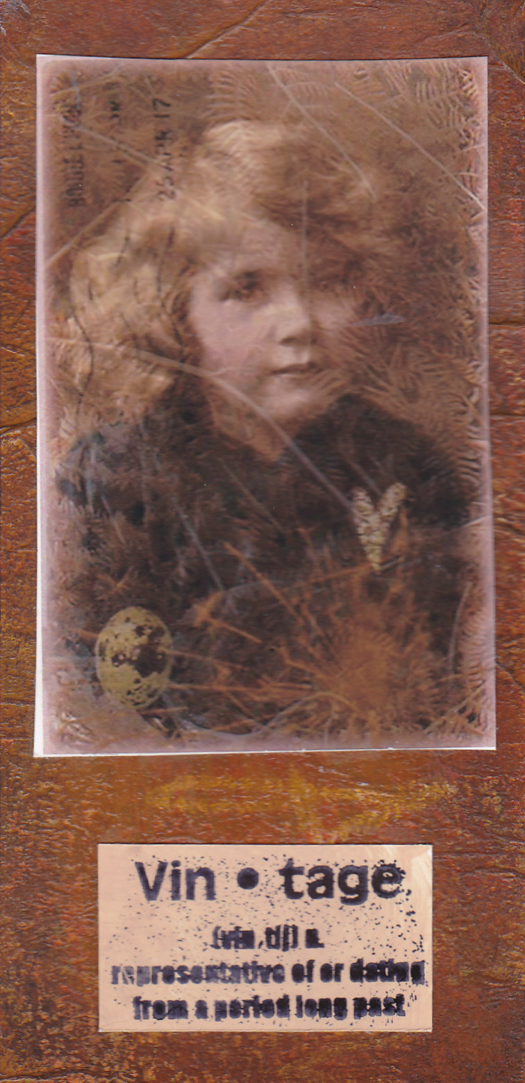
More of the acrylic paint background, this time covered with a digital collage (all my own work), and a stamped definition.
This one is really shimmery in real life - shame the scan never captures that. Moonshadow sprays on watercolour paper, with interest added by sponging acrylic paint through a sheet of ironed angelina. I added a stamped image (Stampers Anonymous), some german scrap, and some letters.

Finally, the background to this is made by crumpling waxed paper, ironing it onto glossy cardstock, then sponging dye ink on. The wax resists the ink, and creates this lovely pattern. I've had this image for ages but never found anywhere to use it. The background colours reminded me of India, so it seemed appropriate to use it at last. I punched three flower shapes out, and backed the holes with some pearlescent pinky red card, and added some sari ribbon. Clever autocrop chopped the bottom off!


